The container element is a foundational building block in the Page Studio builder. Containers are used to group, position, and style other elements on your page, giving you control over layout, spacing, and alignment.
The fine print
- Containers make up the structure or your landing page, and can act as sections, columns, and row.
- You cannot place elements directly on the Page level, and all elements must be placed within a container.
- Each container has a direction setting, which determines whether the nested elements stack vertically or horizontally.
What is a container?
A container is an element that holds other elements, such as text, images, buttons, and even other containers. This element helps organize content and control how elements are arrange on the page.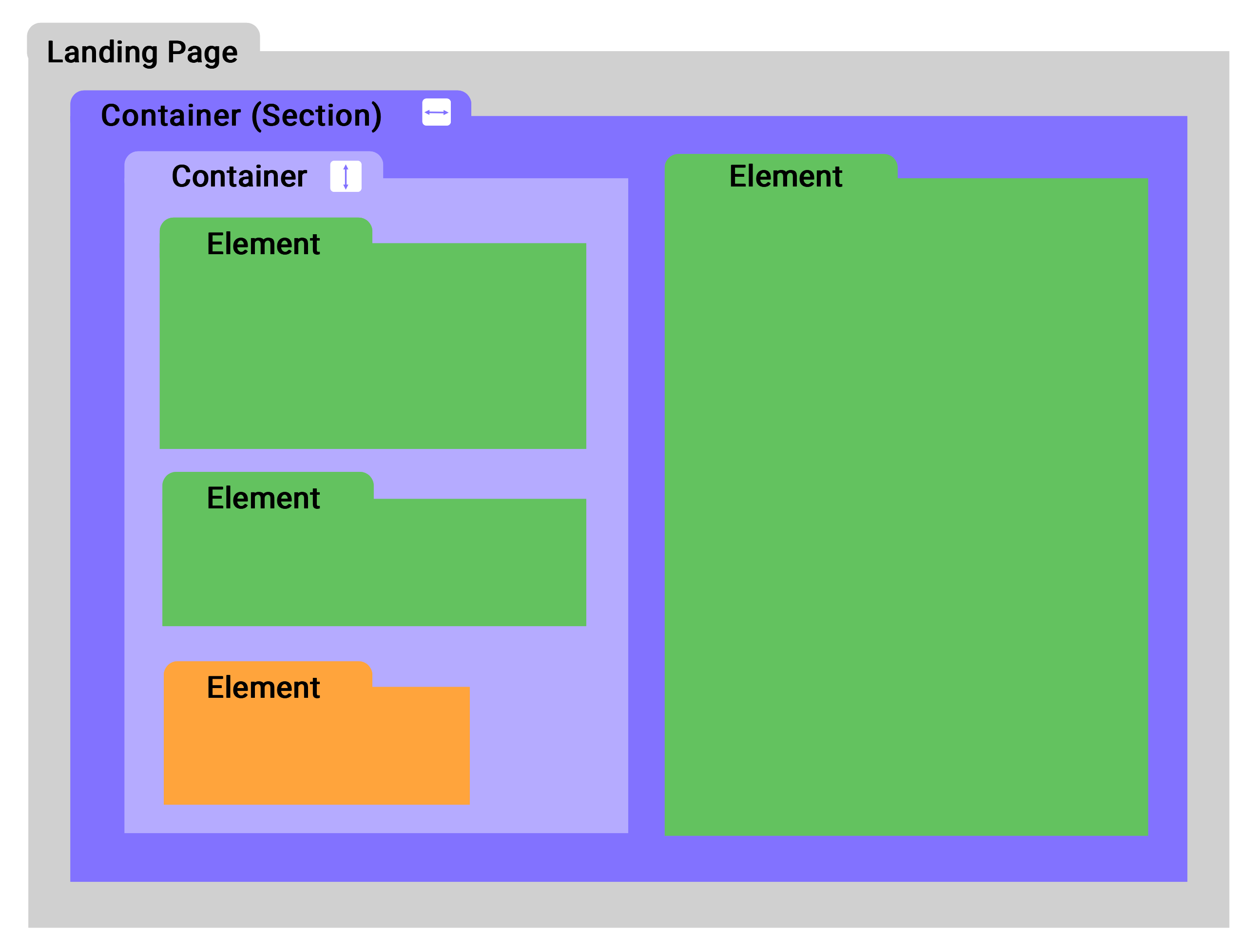
A container can act as a:
- Section
- Row
- Column
This behaviour is determined by the container's direction setting:
- The vertical direction stacks elements top to bottom
- The horizontal direction places elements side by side.
Any container that sits directly on the landing page level functions as a section. While sections are containers, not all containers are sections. Any container placed inside another container is not considered a section. You can read more about how sections work in our article here.
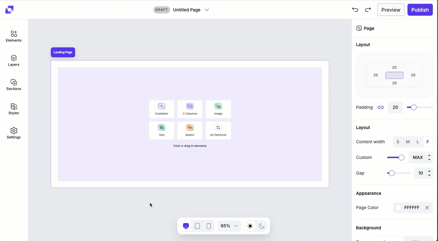
Adding a container element
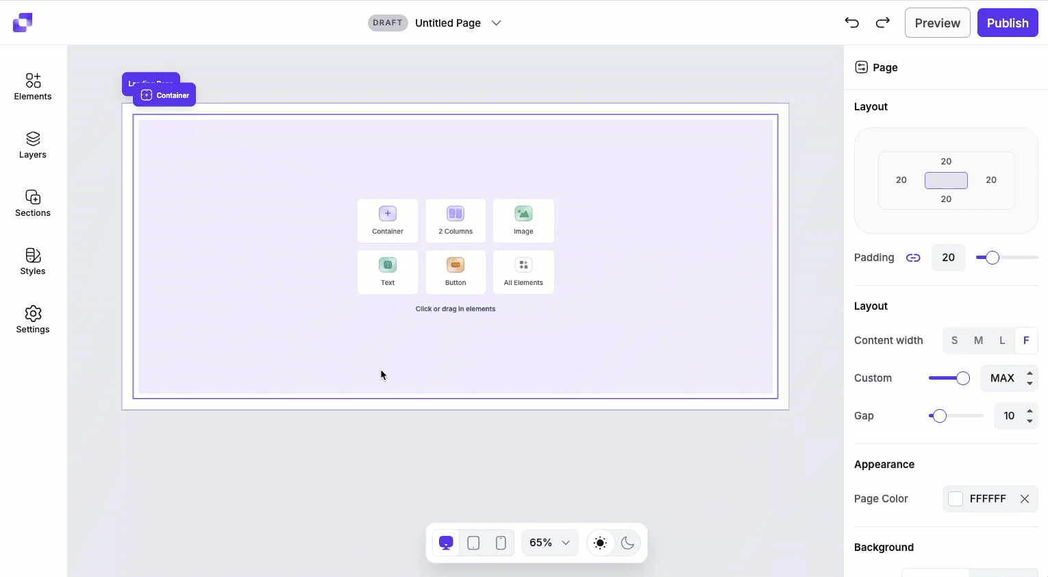
If you're creating a page from scratch, you'll notice that a container will already be placed on your page. You can add further containers into the section by clicking the container icon directly on the canvas, or dragging a container from the Elements panel.
- Open the Elements panel.
- Drag and drop the container element onto your page.
Building layouts with containers
Containers can be used to create dynamic sections, allowing you to build flexible, custom layouts on your page. By adjusting a container's direction and nesting containers inside one another, you can build multi-column and multi-row layouts.
Create a two-column section
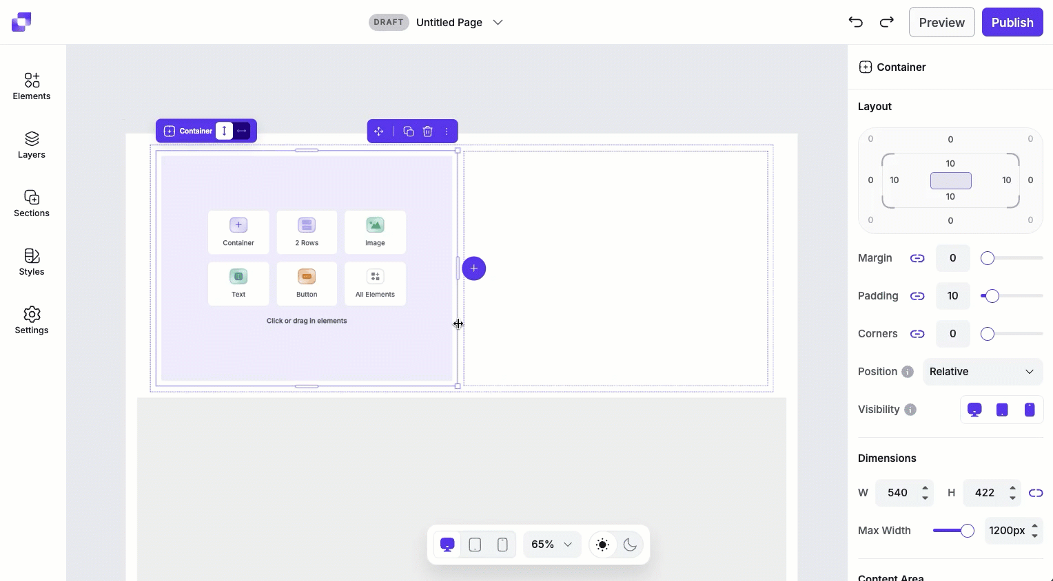
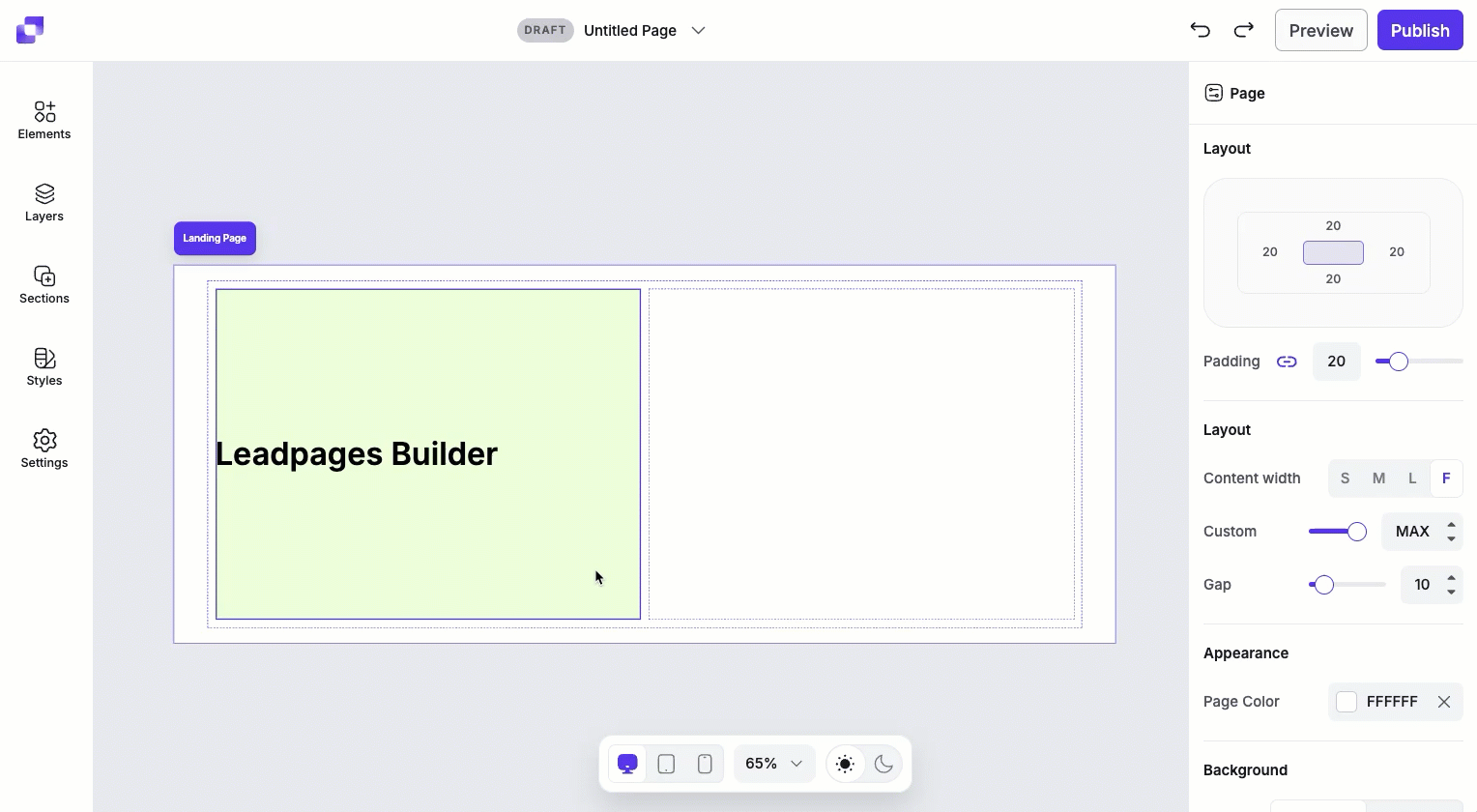
When a container's direction is set to horizontal, and there are no other elements within it, you'll see an option to add 2 Columns to the container.
- Click the empty container.
- Ensure the container's direction is set to horizontal.
- Click 2 Columns
This adds two nested containers inside the parent container, which sit side by side. By default, these nested containers use a vertical direction, allowing content inside each column to stack top to bottom.
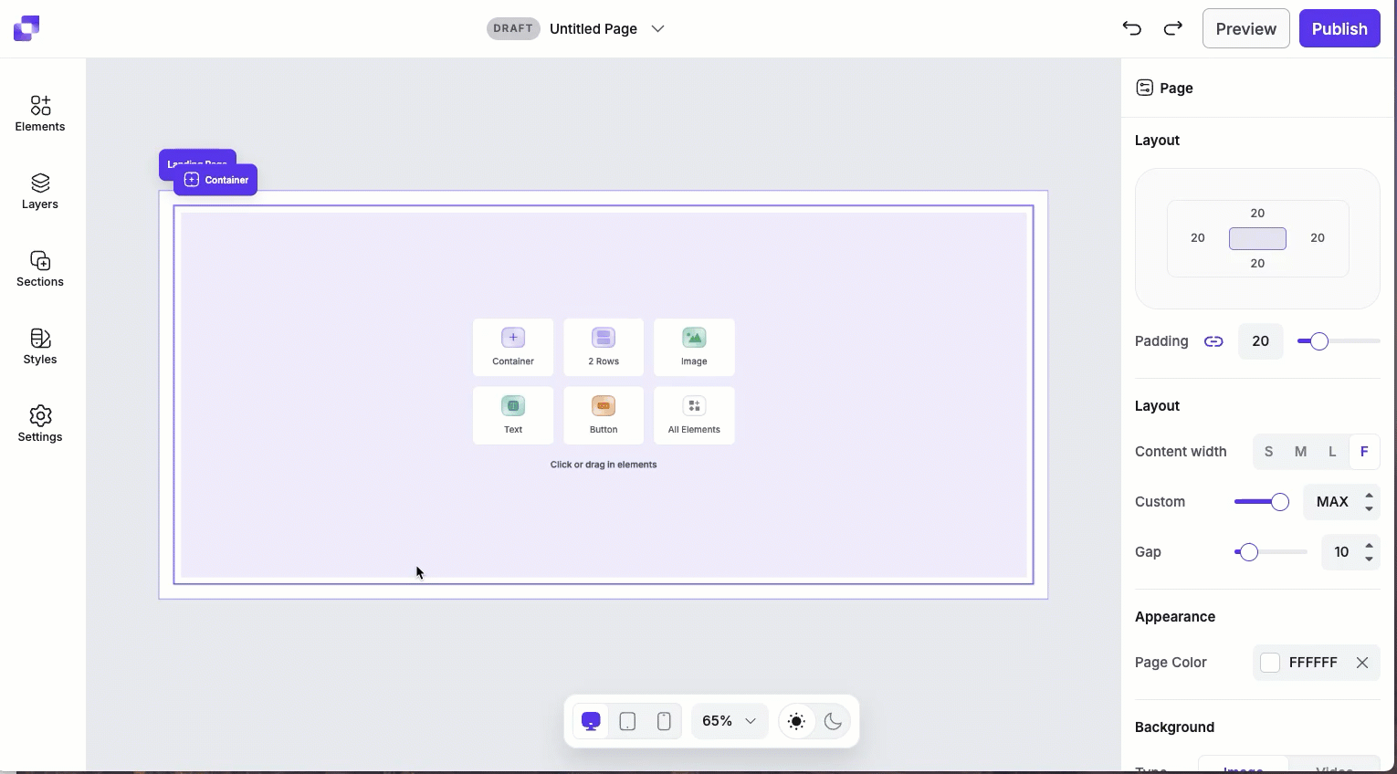
Create a two-row section
When a container's direction is set to vertical, and there are no other elements within it, you'll see an option to add 2 Rows.
- Click the empty container.
- Make sure the container's direction is set to vertical.
- Click 2 Rows.
This adds two nested containers stacked vertically. Each nested container also uses a vertical direction by default.
Adding additional rows or column
After adding nested containers, you can continue expanding your layout.
- Click on a nested container.
- Click the purple "+" icon that appears on the canvas to add an additional row or column.
Canvas quick actions
Each container includes a quick actions menu that lets you make fast changes. From this menu you can:
- Rename the container element.
- Copy the container to paste elsewhere on the page.
- Duplicate the container, which will appear under or to the right of the container (depending on the direction of the container the text sits it).
- Hide/Show the container.
- Lock/Unlock the container. Locking an element can help prevent accidental edits or movement.
- Delete the container element from the page.
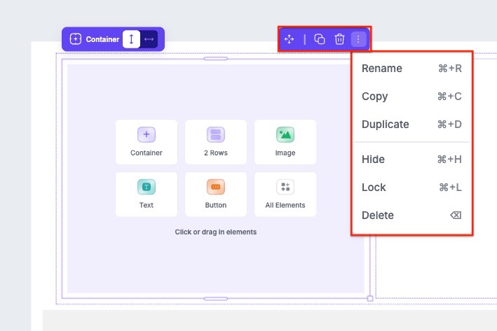
If the container is a section, you'll notice that you will have the ability to move the section up and down the page with the arrows in the quick actions bar.
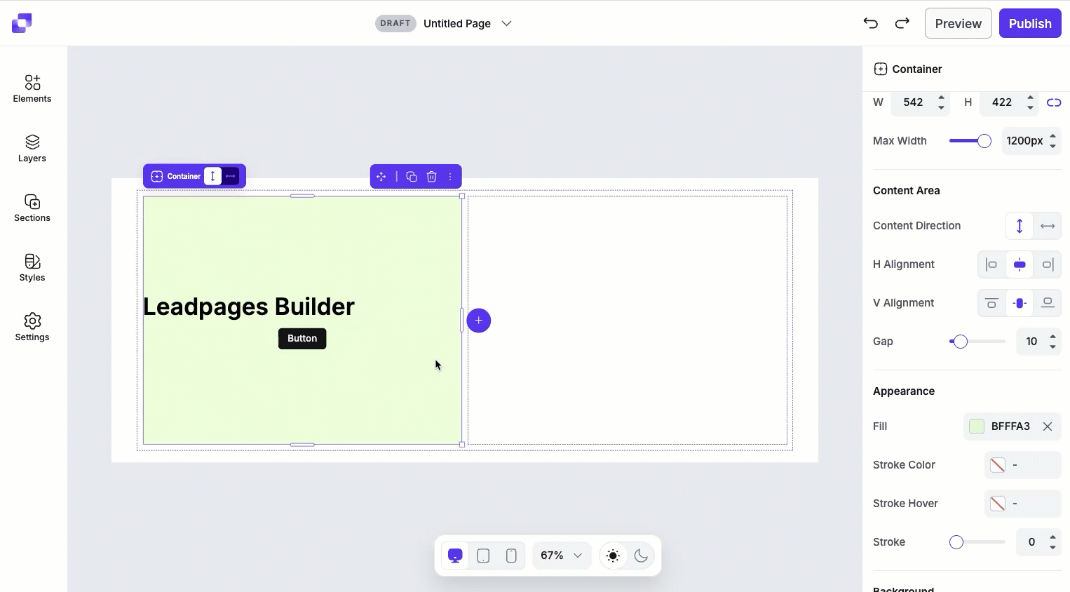
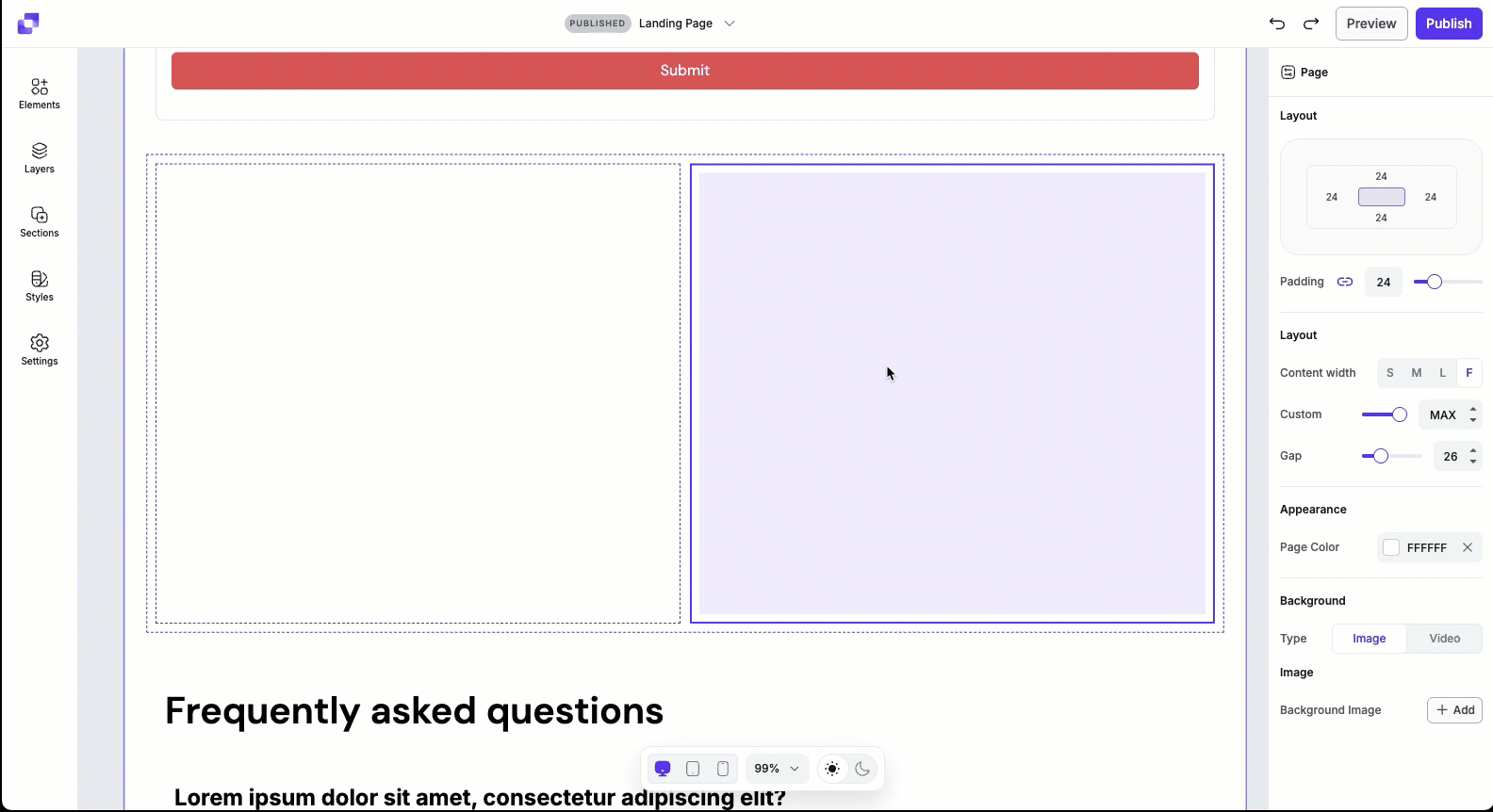
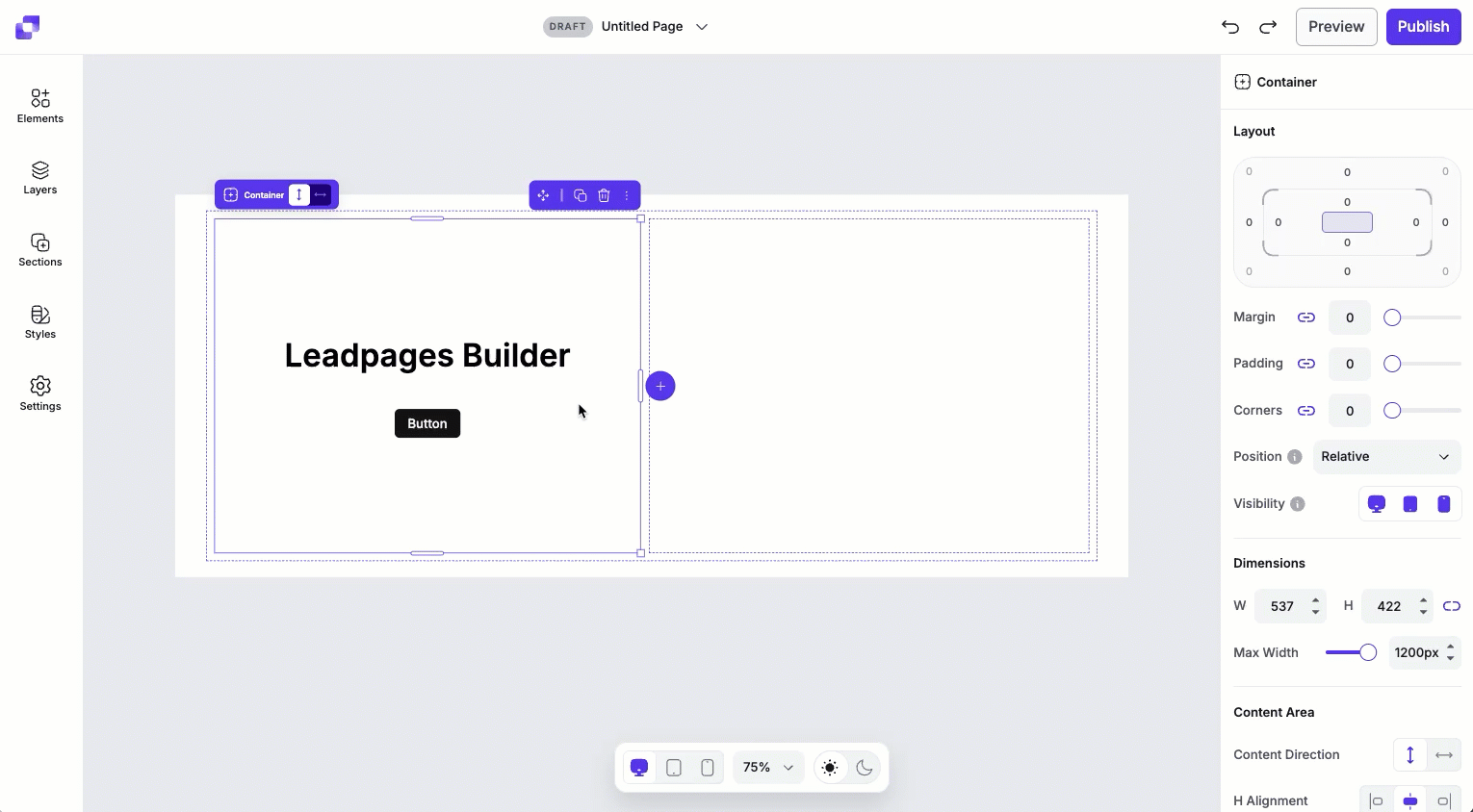
Container layout settings
Under Layout, you can adjust the padding, margin, and corners to control how the container element fits within its parent container. You’ll also be able to adjust its position and visibility. To learn more about the Layout settings, in general, you can visit this article.
Dimension settings
Dimensions shows the current width and height of the container element. To adjust the width and height:
- Height: Use the H field to adjust the container element height by increasing or decreasing the value. You can also adjust the height by dragging the resize handles on the canvas.
- Width: Adjust the container element width using the Max Width slider.
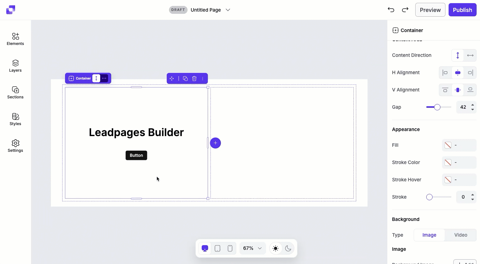
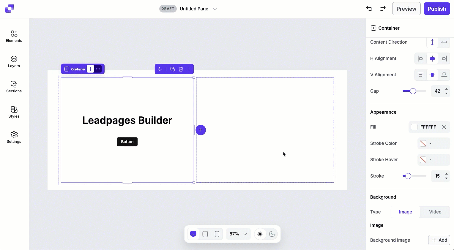
Content alignment settings
Content alignment settings determine how elements inside the container are positioned. These settings apply to all elements nested inside the container, making them useful for quickly centering or evenly spacing content.
- Content direction: Choose whether nested elements are laid out vertically (stacked top to bottom) or horizontally (placed side by side).
- Horizontal (H) alignment: Align elements left, centre, or right within the container.
- Vertical (V) alignment: Aligns elements top, centre, or bottom within the container.
- Gap: Adjust the spacing between elements inside the container.
Container styles
Fill
The Fill settings adds a background color to the container.
Stroke
The Stroke settings let you add a border around the container:
- Stroke color: Sets the border color.
- Hover color: Changes the border color when the container is hovered over.
- Stroke width: Controls the thickness of the border.
Strokes can be useful to separate an image from surrounding content or to add emphasis.
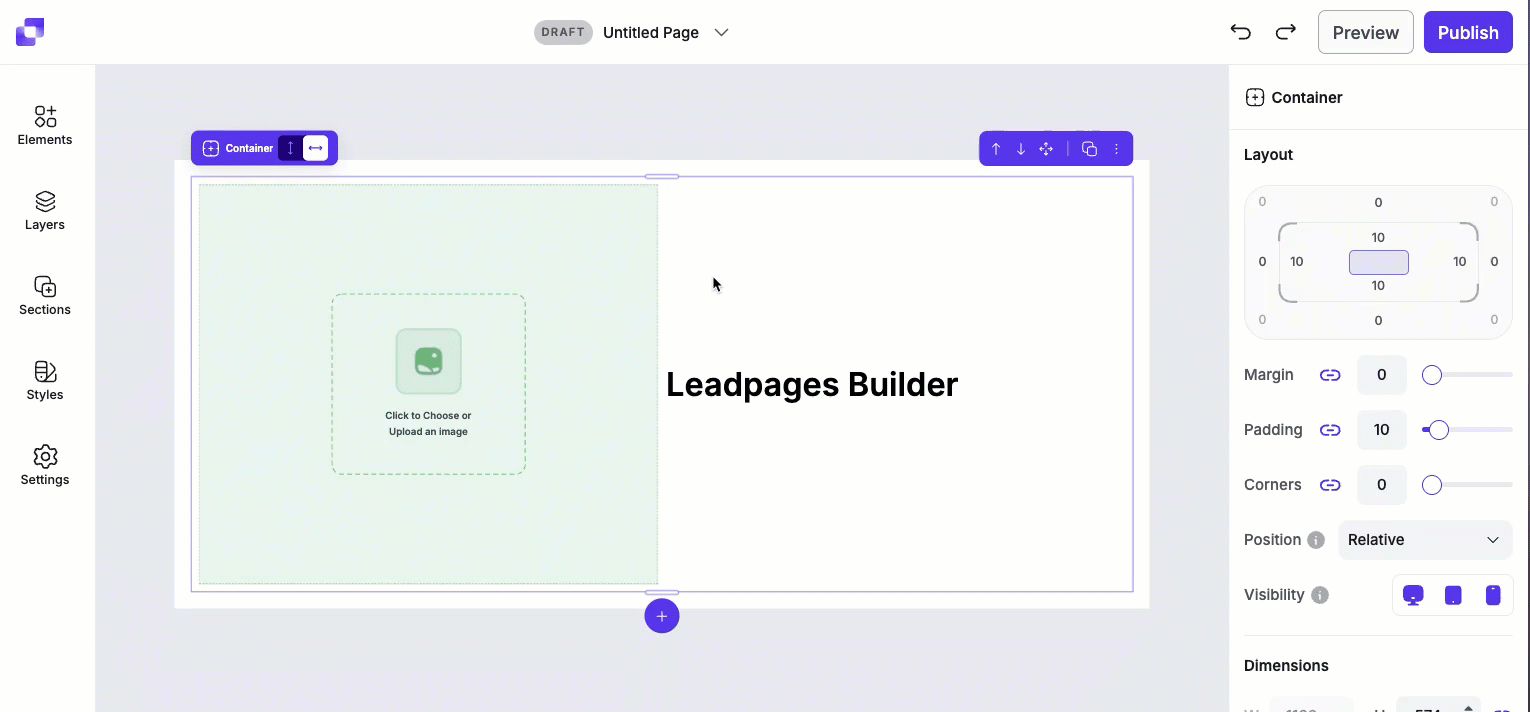
Background image or video
Add visual depth by placing an image or video to the container element. After selecting the background type (Image or Video), fields corresponding to that type will appear for you to edit.
Image
Once the Image tab is selected, you'll be able to upload an image by clicking on the + Add button. From there, you can upload an image directly from your computer. Once uploaded, you'll be able to adjust the image's:
- Mode: The Mode setting determines how the image fits inside the container. You'll be able to select from Fill, Fit, Stretch, and Tile. By default, the image will set the mode of the image to Fill.
- Position: The Position setting controls how the image is aligned within the container. Options like top, centre, bottom, left, and right let you choose which part of the image remains visible when cropping occurs (such as when using Fill mode).
- Opacity: Opacity adjusts how transparent the image is within the container. Lowering the opacity can soften the image or help it blend more naturally with the page background or container fill color.
Video
Once the Video tab is selected, you'll be able to add a video to the container by adding in the video URL or video embed code.
- Select the Source (URL or embed).
- Add in the corresponding info to the field below.
- Select the Provider (Youtube, Vimeo, Wistia)
- Once added, you can further adjust the Mode and Opacity of the video.
Frequently asked questions
Is there a limit to how many containers I can add within a section/parent container?
Within a section container, you can add up to 11 columns side by side.
Separately, there is a limit to how deeply containers can be nested. You can nest containers inside other containers up to 24 level deep.
I have a column in my section— can I add row containers into it?
Yes, of course! You can add row containers by clicking on the empty column container, making sure that the direction for the column is set to vertical, then clicking the 2 Rows prompt on canvas.
Need more help?
You can always get in touch with our support team—just click Support in your Leadpages navigation menu, or submit a ticket ↗