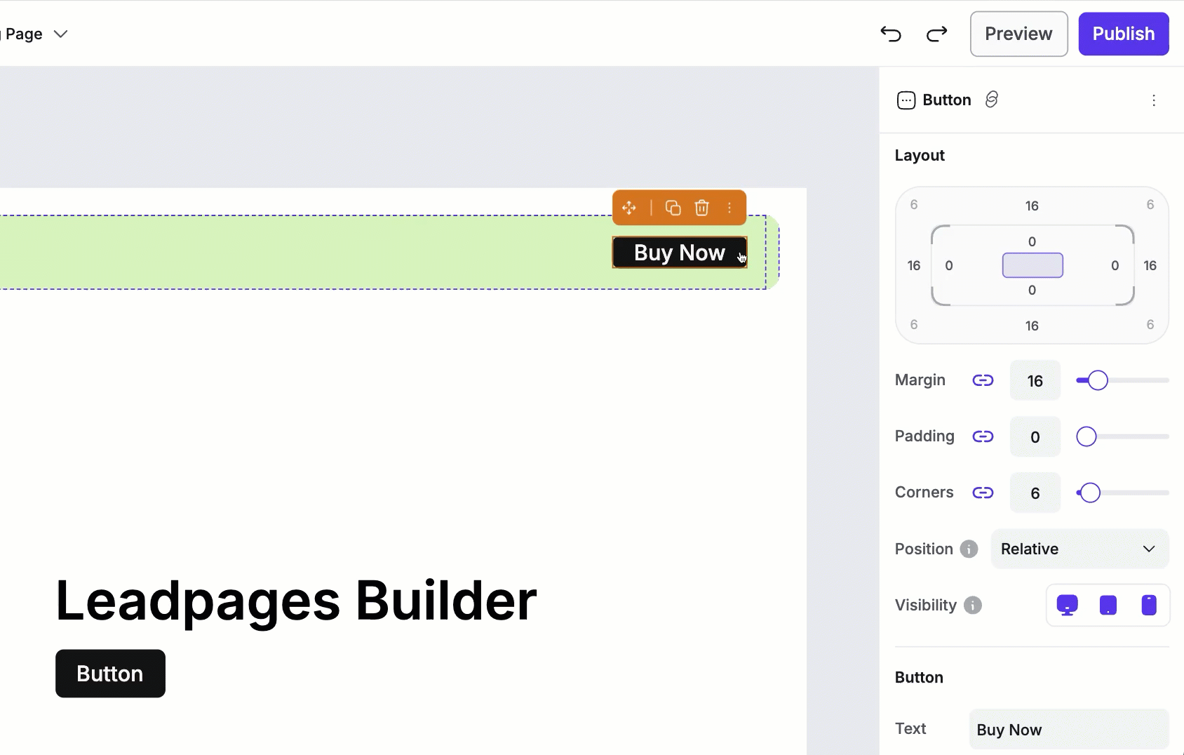
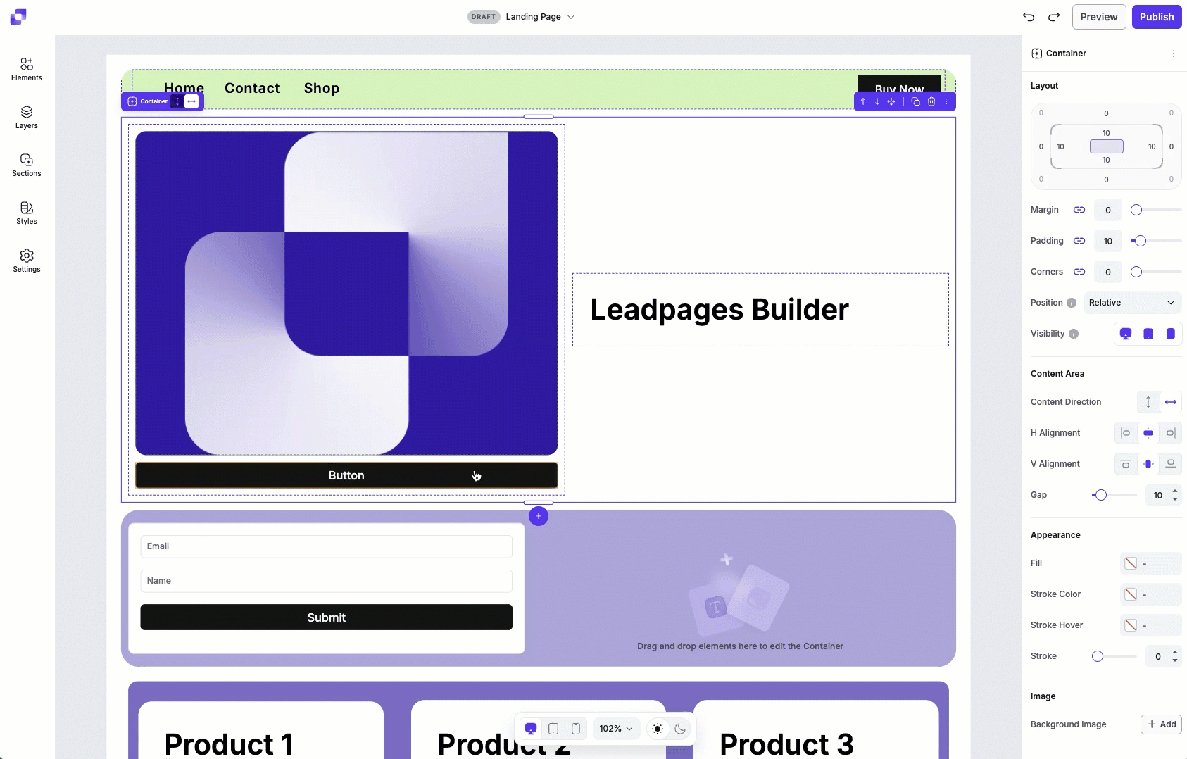
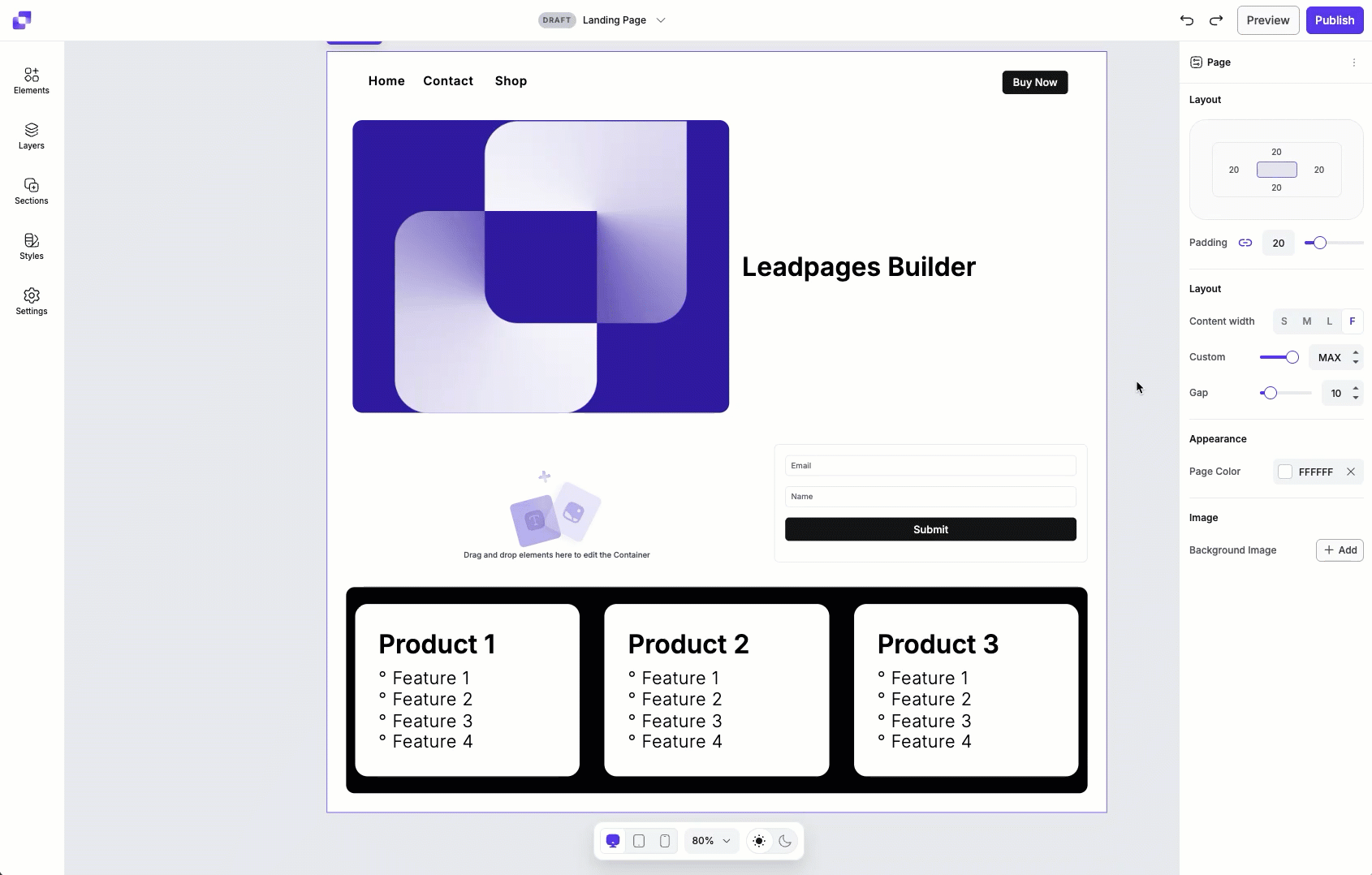
Layout settings control the spacing, alignment, and overall structure of your page or individual elements. They appear in the Edit panel whenever you select a page or element on the canvas, and it gives you precise control over how content is positioned and displayed. While the available options in the Edit panel may vary for different elements, every element will include layout settings.
The fine print
- This article goes over the Layout settings of Page Studio landing pages, to learn more about how to adjust the layout of Classic Builder landing page sections, visit this article.
- Every element on the page will have Layout settings which you can configure.
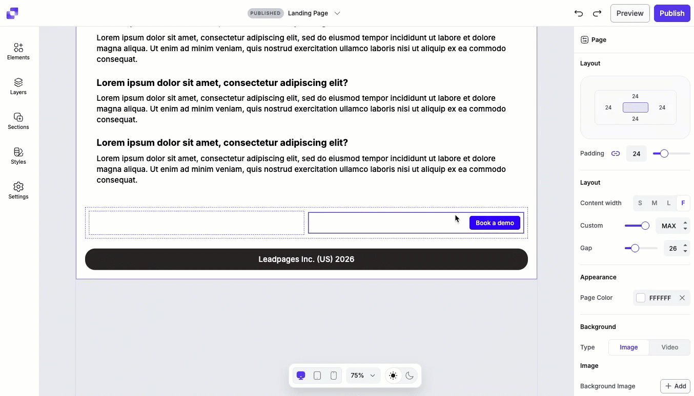
- On the Page level, you can only adjust padding, overall content width and content gaps.
Layout settings
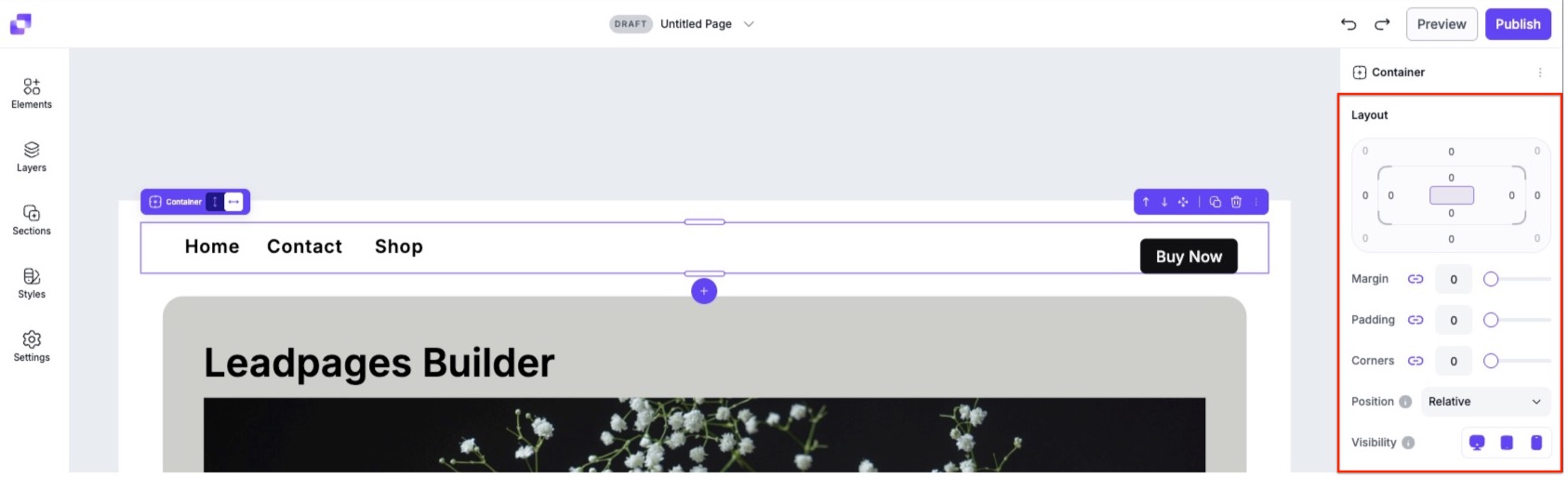
The Layout area in the Edit panel lets you control how your sections and elements are spaced and positioned on page. These settings help you fine-tune the structure of your design. The main layout controls are:
- Padding
- Margin
- Corners
- Position
- Visibility
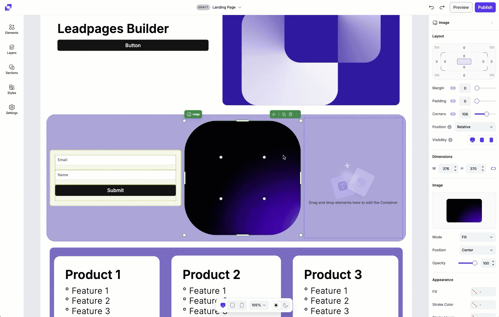
At the top of the Edit panel, you'll see the Layout settings. The Layout settings will have a visual diagram that represents the element or page that you currently have selected on canvas. This visual is designed to help you understand how spacing works by showing you where padding, margin, and corners sit in relation to the element. Position and Visibility settings will not be represented in the visual diagram.
The diagram has four main parts:
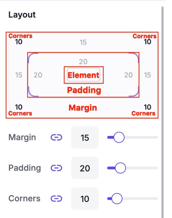
- The inner box: This represents the content area of your element or page.
- The space directly around the inner box: Represents padding (the space inside the element, between the content and its border).
- The outer area surrounding the entire box: Represents margin (the space outside of the element, which separates it from other elements).
- Outer box corners: The values shown in the four corners of the outer box represent the corner radius. This setting can round the corners of the outer margin area.
As you change the settings in the Layout area, the visual diagram will update in real time to reflect the values you’ve set.
Position types
The position setting controls how an element is placed within the page layout. This option allows you to move elements in relation to their surrounding content. The available position types are:
- Relative
- Absolute
- Fixed
- Sticky
Relative
By default, all elements will be set to relative. A relative element stays in its normal spot on the page, but you can nudge it around based on other element positions, or layout settings.
Examples:
- If you have two elements in a section (text on the left, image on the right) and you move the text to the right of the section, the image will adjust to occupy the space on the left.
- If you increase the size of the text element, the image will shrink or move to make room, because the layout adjusts automatically.
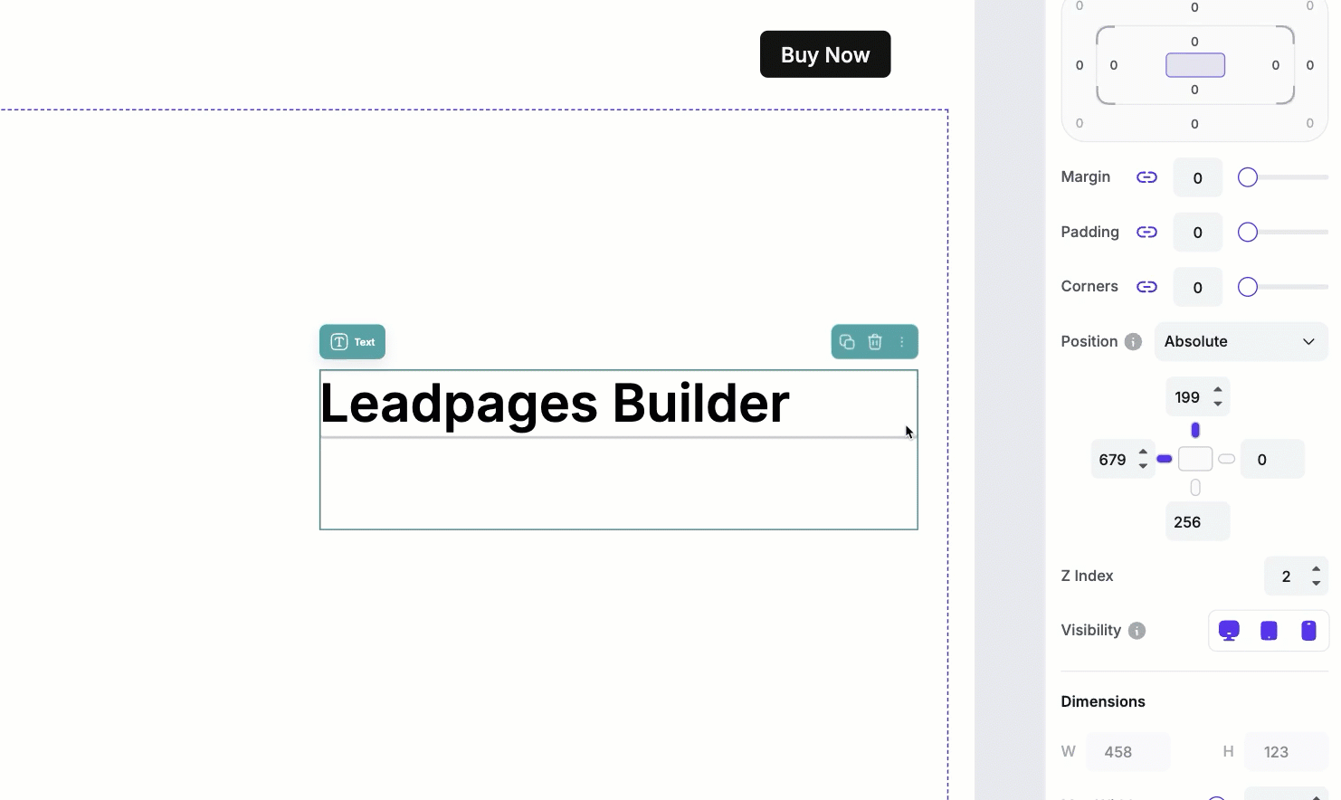
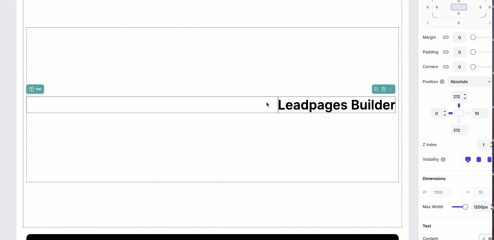
Absolute
The element is placed exactly where you want inside a container and it does not affect other elements. This allows for more precise placement, but surrounding elements won’t adjust around it.
Example:
- Placing a decorative icon in the corner of a section—other elements like text and images won’t move even if you resize the icon.
Fixed
When you set an element to Fixed, it’s no longer part of the normal page flow. Instead:
- It becomes “attached” to the browser window
- Other elements no longer move around it
- If it doesn’t have a background or spacing, it can blend into or sit behind other content
To prevent unexpected overlaps or spacing issues, fixed positioning is limited to parent containers, where all container elements move together as a single unit.
Example:
-
A floating “back to top” button or a CTA that you always want to be visible on the screen, no matter where you are on the page.
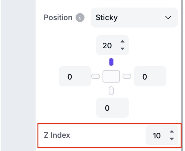
Sticky
The element behaves like it’s in the normal flow until it reaches a defined scroll point, then ‘sticks’ in place. This is often used for headers or navigation bars that remain visible while scrolling within a section.
Example:
- A navigation menu or promo banner that scrolls with the page, but stops and "sticks" at the top once it reaches that position.
Once you've set up a sticky element, you can Preview the page to see the effects of it.
Position settings for Absolute, Fixed, and Sticky elements
When an element is set to Absolute, Fixed, or Sticky, directional position controls become available. These settings determine how the element is positioned within the page or its container. These controls let you fine-tune exactly where the element appears within the container or page.
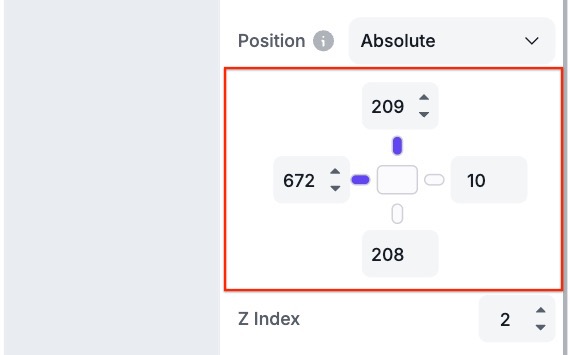
Default directional behaviour
By default, only the Top and Left directional settings are enabled (shown by the purple indicator).
- Top controls the element's vertical position on the page.
- Left controls the element's horizontal position on the page.
You can enable Right or Bottom settings by clicking on the indicator between the value field and the content box. If the Top and Left settings remain enabled:
- Right will adjust the horizontal length of the element's container.
- Bottom adjusts the vertical height of the element's container.
In this state, Right and Bottom do not move the element's position on the page. Instead, they define how far the container extends in that direction.
If you disable Top and Left (by clicking the same indicator to turn it off) and leave the Right and/or Bottom enabled, the behaviour changes:
- Bottom now controls the element's vertical position on the page.
- Right now controls the element's horizontal position on the page.
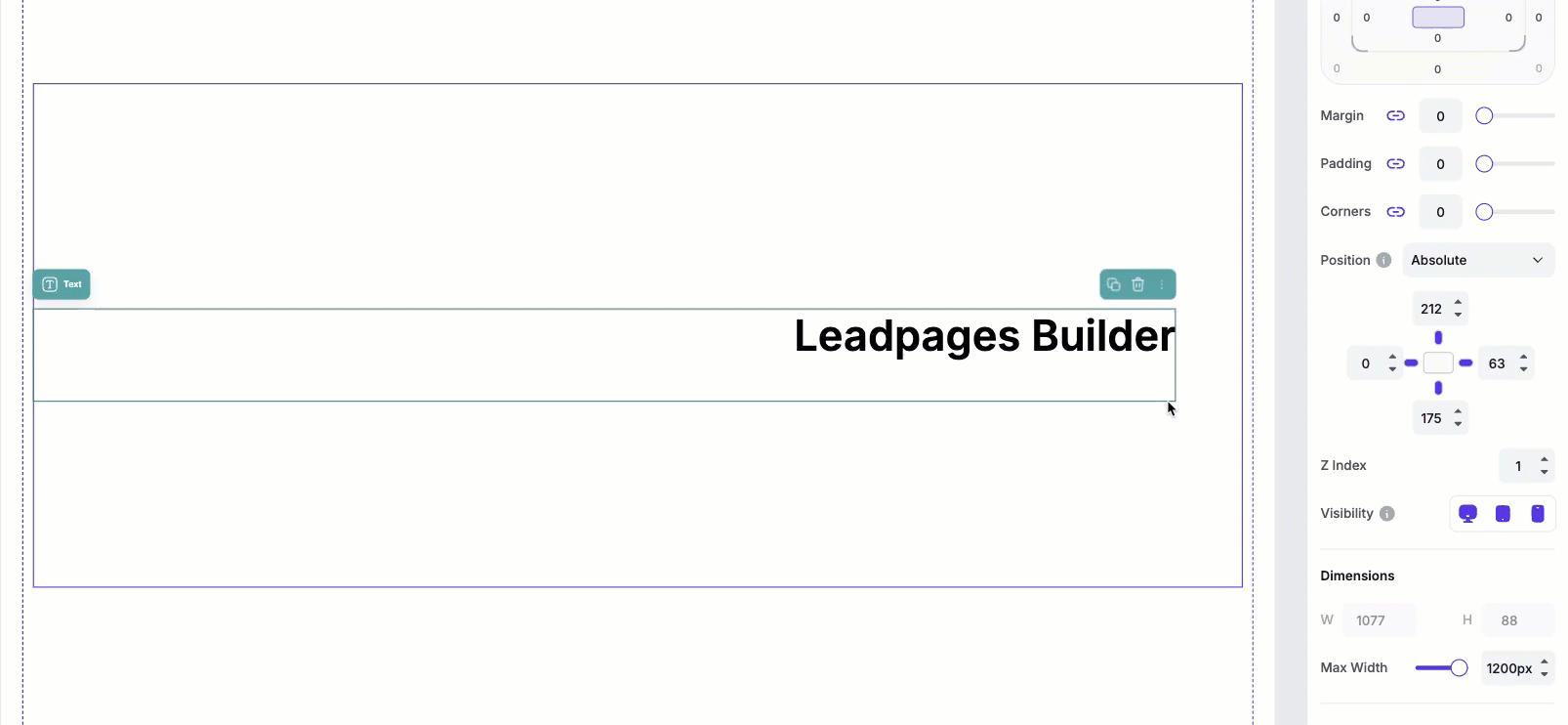
Z-index settings
When the Absolute, Fixed or Sticky positions are selected, when selected, will reveal Z-index settings. The z-index controls how the element stacks in front or behind other elements. A higher z-index means that the element will appear on top of other content, whereas a lower z-index value will cause the element to appear behind other elements.
In Page Studio, z-index values range from -1 to 10.
Visibility settings
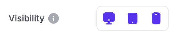
These settings control which devices an element appears on. Simply click the desktop, tablet, or mobile icon to show or hide the element for that specific device.
If you'd like to learn more about optimizing your page for mobile, check out this article for tips.
Frequently Asked Questions
Why is my sticky menu appearing behind other sections when I scroll down the page?
Check the z-index value you've set for the sticky element/container. If the sticky element has a lower z-index value, this will cause it to appear behind other containers on the page when you scroll. If you want to make sure that it stays on top of all elements when you scroll, set the z-index to 10.
Do the Position settings for elements apply to all device views?
Yes. Position settings (such as relative, absolute, sticky, or fixed) apply across all device views. If you change an element's position type, it will behave the same way on desktop, tablet, and mobile
Do Layout settings apply to all device views?
Yes. By default, Layout settings you adjust for an element in desktop view will automatically apply to that same element on tablet and mobile views. This ensures your page stays consistent across devices without extra work.
If you later adjust the Layout settings for that element while in tablet or mobile view, those settings will override the desktop values for that specific device. This allows you to fine-tune the design of your page across different screen sizes.
Need more help?
You can always get in touch with our support team—just click Support in your Leadpages navigation menu, or submit a ticket ↗