Mobile visitors make up a large portion of page traffic, which makes mobile optimization an essential part of building high-performing pages. Page Studio is designed to be responsive by default, but there are a few adjustments that you can make to your page for when you want viewers on mobile devices to see something slightly different than those on a desktop computer.
The fine print
- This article goes over how to optimize your Page Studio landing pages. To learn more about how to optimize your Classic Builder landing pages, visit this article.
- The content of a page is automatically stacked vertically on mobile devices for easy scrolling and access to your content.
- While there is no need for a mobile view editor because of how the builder is mobile responsive, there is a way to show/hide specific sections for specific devices as explained below.
Why mobile optimization matters
As mobile screens are smaller, it's important to build layouts that feel balanced and easy to navigate on mobile. Layouts that feel spacious on desktop can quickly feel crowded on mobile. Optimizing for mobile helps:
- Improve readability and usability
- Keep important content and call to actions visible
- Reduce unnecessary scrolling
Mobile layout behaviour
Page Studio is responsive by default. When a page is viewed on a mobile device, the builder automatically adjusts the layout to fit a smaller screen. The builder will:
- Resize elements proportionally.
- Multi-column layouts are stacked vertically, with the leftmost column being shown first.
This automatic behaviour provides a solid starting point, but most pages benefit from additional mobile-specific adjustments. 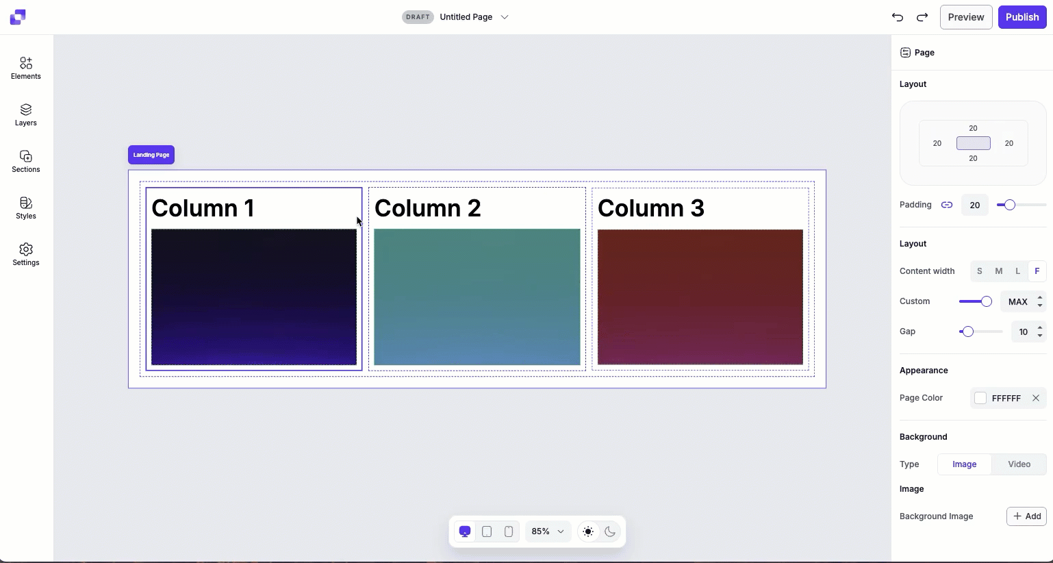
Adjusting layout, dimensions, and content area on mobile
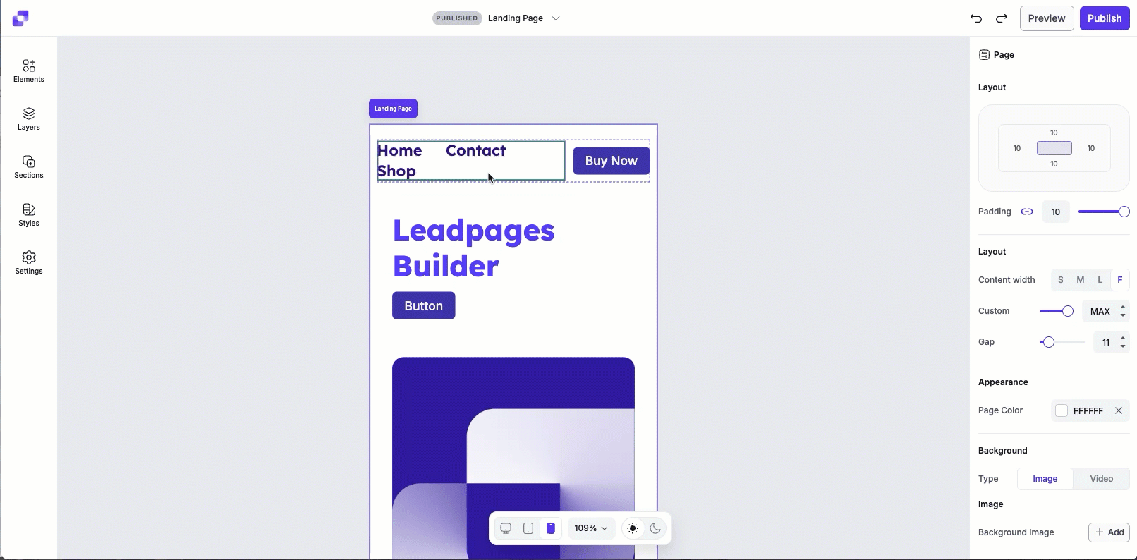
When optimizing your page for mobile, you can adjust layout, dimension, and content area settings directly in the mobile view. This lets you fine-tune spacing, size, and element arrangement without affecting desktop or tablet layouts.
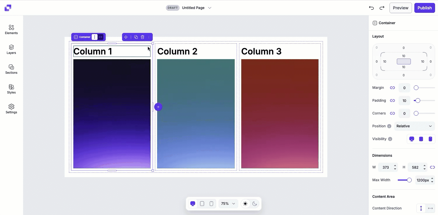
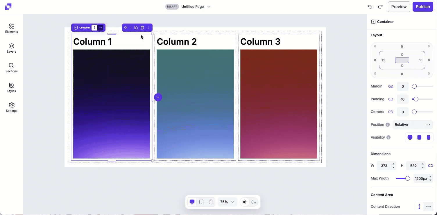
By default, layout settings for mobile and tablet are linked to the desktop view. When the settings are linked, changes made to the layout settings on desktop apply across all devices. If you adjust the layout settings while viewing the tablet or mobile page, the settings automatically unlink from desktop. This allows you to fine-tune spacing for smaller screens without affecting the desktop view.
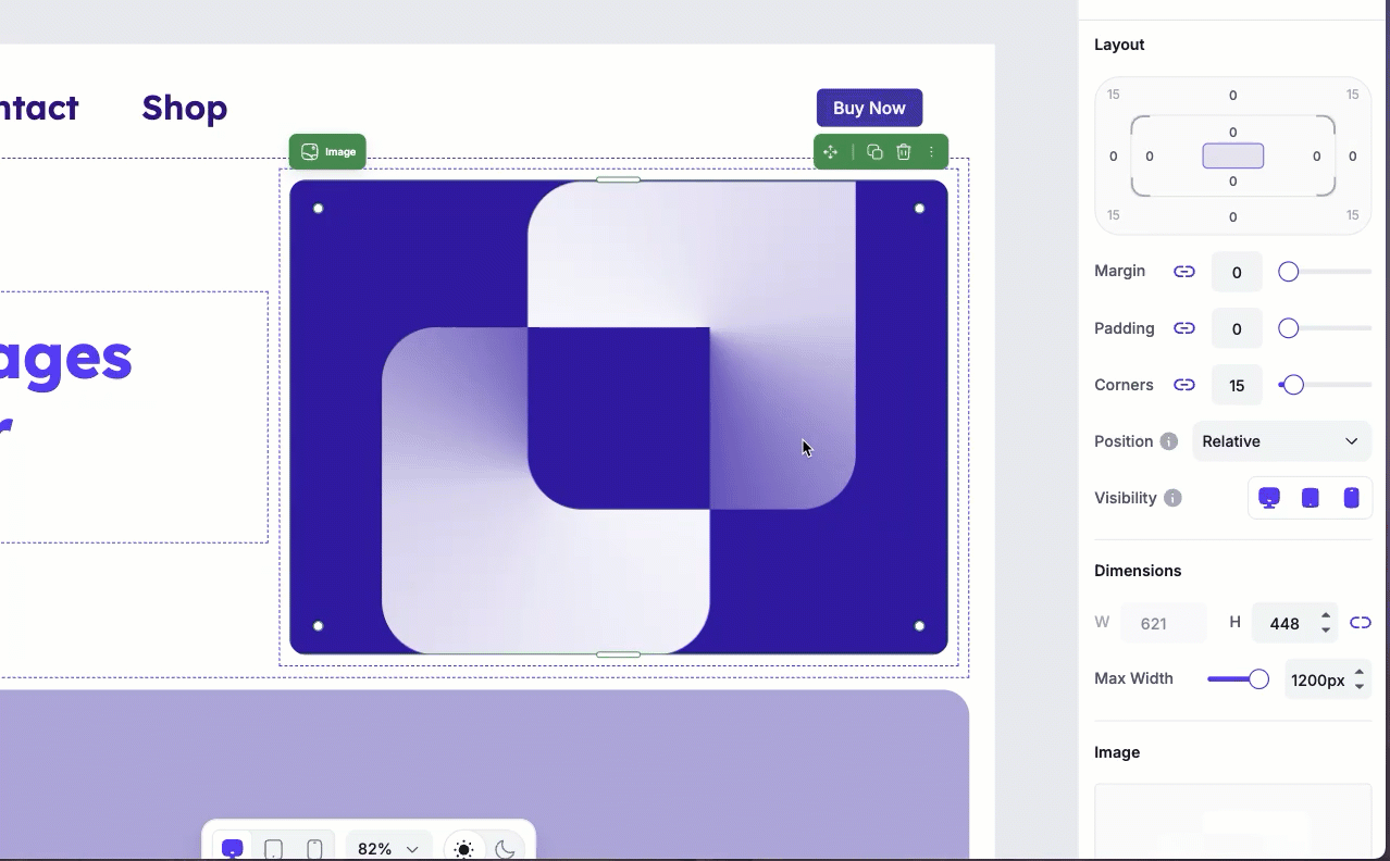
In the GIF below, the margin is adjusted while viewing the mobile layout. Because layout settings can be device-specific, this change applies only to mobile and does not affect the desktop view. Each device can have their own margin values.
Key points for mobile adjustments
- Layout: Change the margin, padding, corners, or position type while in mobile view.
- Dimensions: Adjust height or max width for elements on mobile to improve fit and readability.
- Content area (for containers): Update the content direction, horizontal and vertical alignment, or gap spacing to optimize how elements are stacked or spaced on smaller screens.
Mobile text styles
There are two ways to control how text appears on mobile and tablet devices: global text styles and detached text styles. Each approach serves a different purpose depending on how much control you need.
Global text styles
If the text on your page is linked up to your page style kit (you can read more about style kits here), you can control the size of the text on mobile or tablet devices. This helps prevent text from appearing too large or too small on mobile.
Global text styles are ideal when you want consistency and efficiency. Updating a style kit lets you quickly adjust text sizing and styles across your entire page without editing individual elements one by one.
Detached text elements
Text that is detached from styles gives you more flexibility when styling individual text elements. When a text element isn't linked to a style kit, you can adjust its styling independently rather than following global rules.
However, this flexibility requires a bit more setup. To achieve different text styling per device, you'll need to create a device-specific text element and manage its visibility across desktop, tablet, and mobile. To learn more about how to show or hide elements on specific devices, continue reading on.
Hiding elements or sections on devices
Page Studio lets you control which elements or sections appear on desktop, tablet, and mobile. This feature is useful if you want to adjust how an element looks on a specific device without affecting other views.
You can access the Visibility options by clicking on any element and then navigating to the Edit panel. Under Layout, you'll see three device icons: desktop, tablet, and mobile. Clicking a device icon will hide the element on that device. You'll also see that the device icon will be grey and be crossed out, indicating that it's hidden.
Creating a mobile-only element
- Switch to the mobile view within the builder.
- Click the element you want to optimize for mobile.
- Duplicate the element.
- Click the original element, then click the mobile visibility icon to hide it on mobile.
- Click the duplicated element, then click the desktop and tablet icons to hide it on those devices.
- Edit the duplicated element as needed.
Background images
Background images can enhance a page visually, but there's a few things to note:
- Because background images scale to fit the device on which the page is being viewed, it’s best to use pictures that don’t contain essential elements like text or faces, as parts of the image may be cut off as the image scales to the mobile view.
- Use high-contrast images to ensure that your text remains readable over the background.
- If a background doesn't work well on mobile, consider replacing it with a solid color or a simpler image to maintain clarity.
- If you want to set up a mobile-only section, portrait images would be ideal for full-screen mobile backgrounds if you want to ensure that certain aspects of the image are visible.
Frequently asked questions
Will mobile changes affect my desktop layout?
It depends on what you're changing.
- Element styles (font, color stroke, etc.) are shared across all devices. Updating these will affect desktop tablet, and mobile.
- Layout/dimension/content area settings can be adjusted separately for each device without affecting the other views.
If you want to make device-specific changes beyond layout settings, you would have to create a mobile-only element and hide the original on mobile.
Can I have elements sit beside each other horizontally in the mobile view?
Yes! If the elements are in the same container, and the direction of the container is set to horizontal, the elements within it will sit side by side.
Is there a way to show more than one column across on a mobile device?
Yes! In order to have the columns be shown side by side on mobile, you need to adjust the container direction of the parent container that nests the columns to horizontal.
How do I stack things differently on mobile?
If you're looking to adjust how things are stacked only on a mobile device, then it's best to set up a mobile-only section.
I've accidentally hidden an element on all devices— help! How can I get it back?
You'll be able to access the element's settings through the Layers panel. Locate the element under Layers, then click it. That will pull up the Edit panel on the right-side of the screen, and you can adjust the visibility settings from there.
Need more help?
You can always get in touch with our support team—just click Support in your Leadpages navigation menu, or submit a ticket ↗