Buttons turn clicks into action. In the Page Studio builder, you can add call-to-action buttons to your page and link them to a landing page, an external URL, or a section on the same page.
The fine print
-
This article goes over the button element for the Page Studio article. If you’re using the Classic Builder,
you can learn more about the button widget here.
- New buttons added to your page will be connected to the Page style kit by default.
- The button element cannot link to pop-ups at this time.
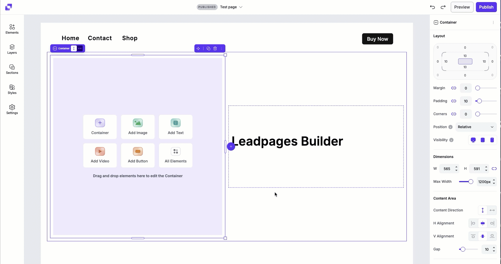
Adding a button to your page
To add a button to your page:
- Open the Elements panel
- Drag and drop the button element onto your page
- Alternatively, if you have an empty container, you can select Add Button to quickly add one.
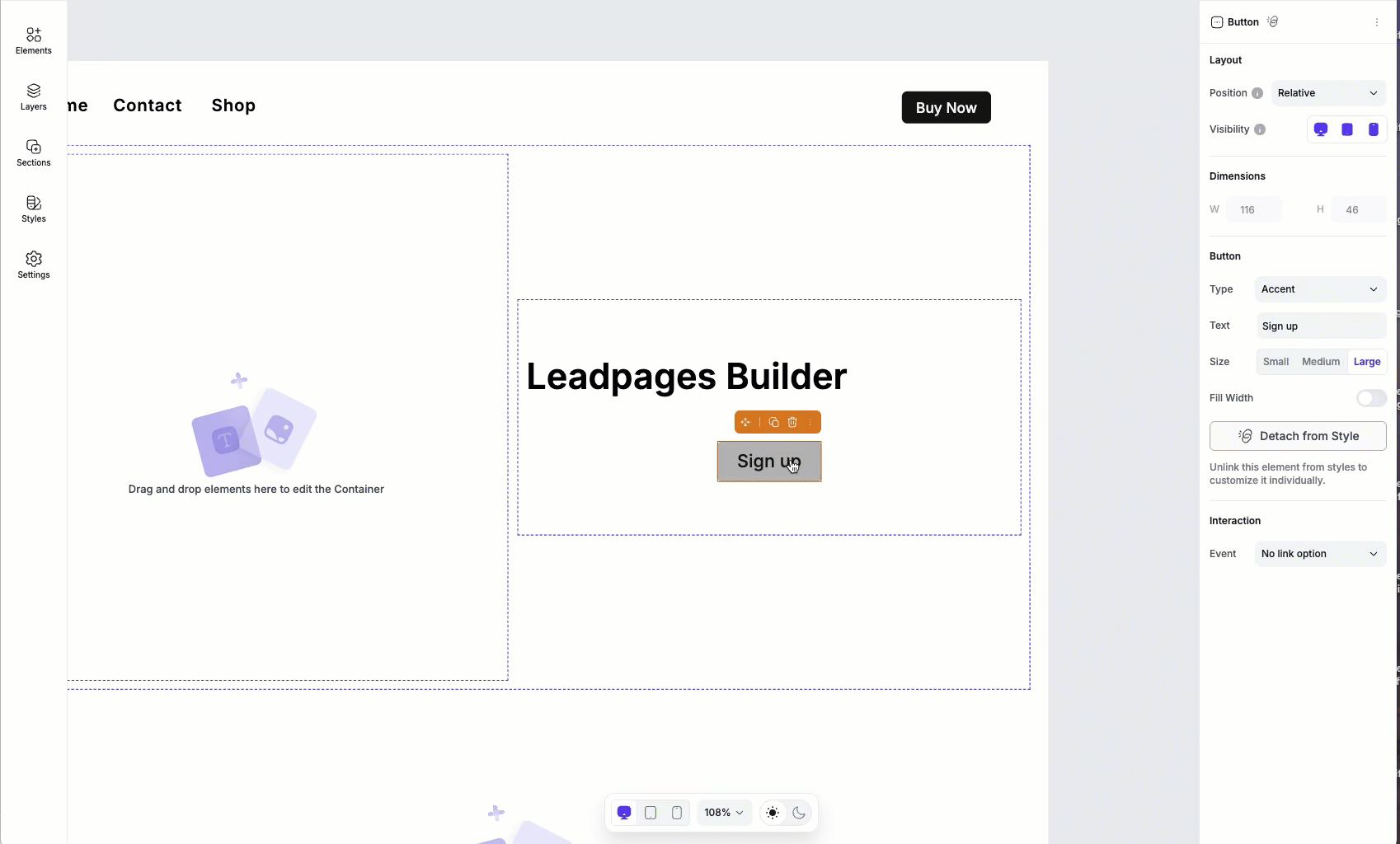
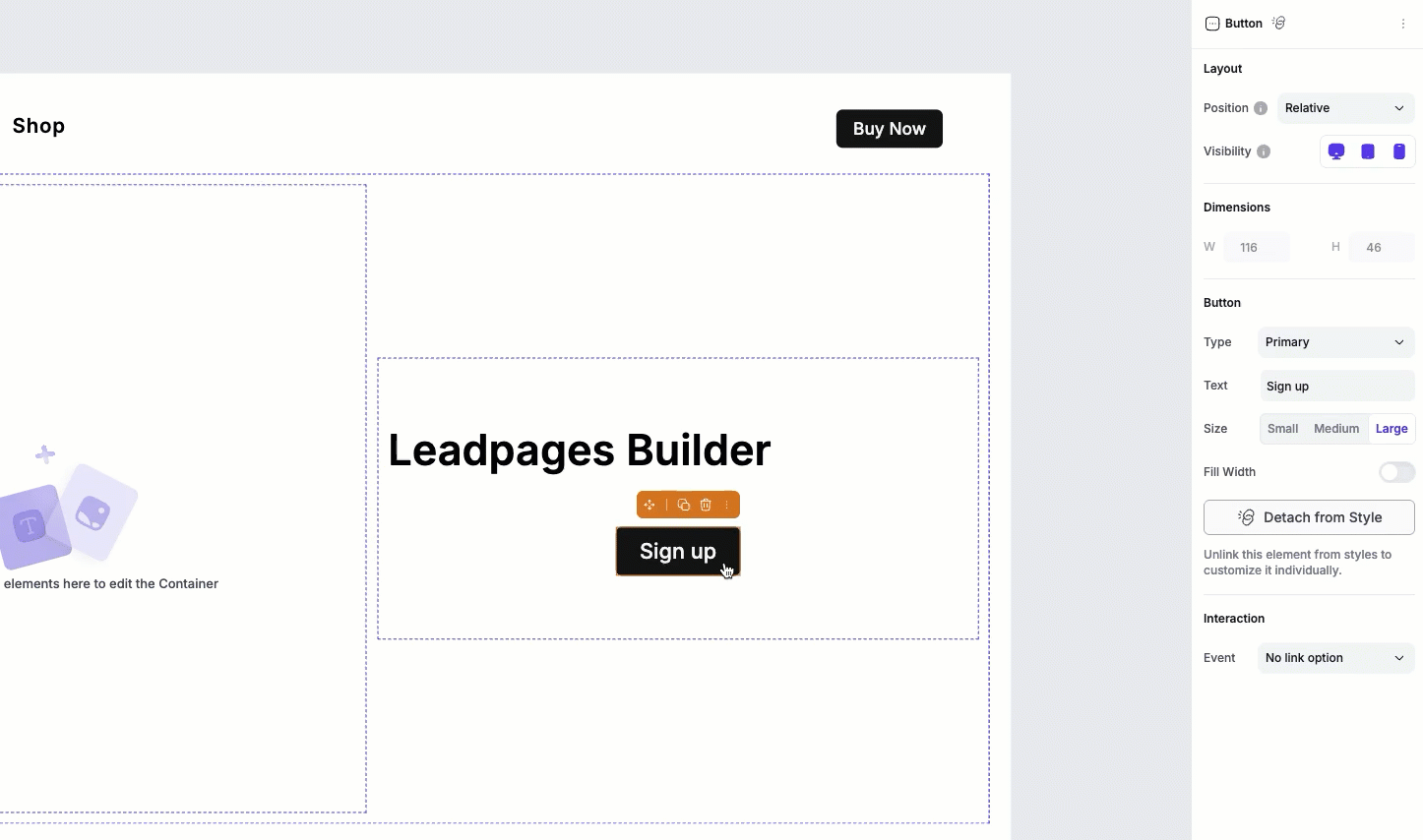
Once added, you can click on the button on the canvas to access its settings in the Edit panel.
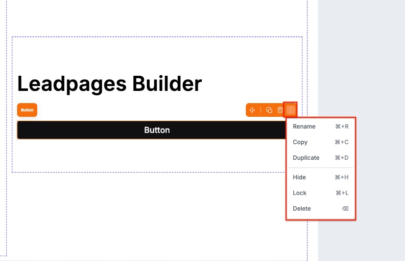
Canvas quick actions
Each button includes a quick actions menu that lets you make fast changes. From this menu you can:
- Copy the button to paste elsewhere on the page.
- Duplicate the button, which will appear under or to the right of the button (depending on the direction of the container the button sits it).
- Hide/Show the button.
- Lock/Unlock the button. Locking an element can help prevent accidental edits or movement.
- Delete the button from the page.
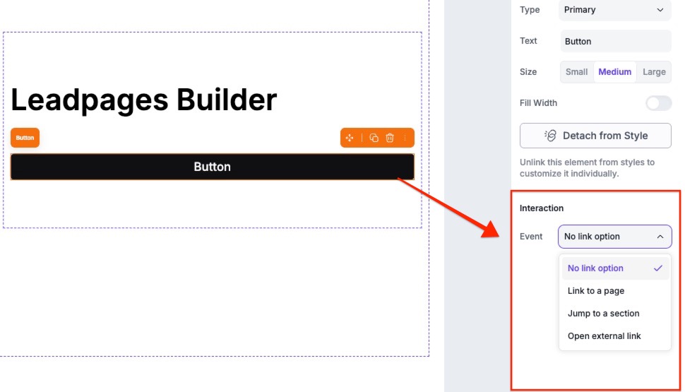
Adding a click event
You can set up your button with an event that will occur once users click on the button.
Adding click events
You can link your buttons to one of the following click events:
- Page section (takes visitors directly to a specific part of your page)
- Landing page (directs visitors to another published Page Studio landing page)
- External URL (directs visitors to a different page or site)
To edit or choose a click event for your button, simply click the button element on the canvas to pull up its settings in the Edit panel. Then, under Interactions, select an event from the dropdown.
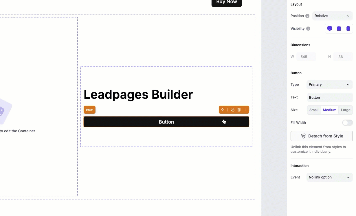
Customizing and styling a button
Global button styles
By default, buttons are connected to the page’s style kit, even if you haven’t explicitly applied one yet. This helps keep your design consistent across the page. When a button is attached to styles, you will only be able to apply these style settings to the button:
- Type (your primary, secondary, or accent global button styles)
- Button text
- Button size (small, medium, or large)
- Button width
Edit global button styles
To edit your global button styles, you can read more about how to set up, edit , and apply your style kit here.
Customize an individual button
If you want to customize a button individually, you’ll need to detach it from Styles in the Edit panel.
Once detached, all appearance and text style options will become available, allowing you to fully customize the button independently from the style kit.
Formatting and styling options
When a button is detached, you’ll have these options with the Edit panel:
| Button appearance | Button text styles |
|---|---|
| Button style | Font |
| Width | Text weight |
| Background color | Letter spacing |
| Hover color | Text color |
| Stroke color | Text hover color |
| Stroke width |
Button alignment
Buttons don't have their own alignment controls. Instead, their position is determined by the container they live in.
To align a button:
- Click the container that the button is nested in.
- In the Edit panel, adjust the horizontal and vertical alignment settings.
These alignment settings apply to all elements within that container, including buttons, images, and other content.
Tips and frequently asked questions
Can I count button clicks as conversions with the button element?
At this time, you will not be able to record button clicks as conversions in Page Studio pages.
Is there an option to link the button to a pop-up made in the account, made under Conversion Tools?
Absolutely. You'll need to create the pop-up's URL by following the Advanced Publishing Options for Pop-ups guide, then add the pop-up's URL in the external URL link option.
How do I attach a phone number or email to a button?
You can learn more about how to set up phone, email, SMS, or WhatsApp links in Page Studio in our guide here.
Can I link a button to third party/HTML code?
Unfortunately no. You can either use our HTML element to apply a third party button or use the method above by applying an HTML element to your pop up.
Tip: Don’t forget to link the button.
Although you can create a button without linking it to a destination, we recommend linking your button to something, so that your visitors are not confused if they click on a button and nothing happens.
Tip: Select a button color that stands out from the rest of your page.
A bold color will draw a users’ eye directly to your button, making them more likely to click it.
Need more help?
You can always get in touch with our support team—just click Support in your Leadpages navigation menu, or submit a ticket ↗