Styles makes it easy to apply consistent branding across all of your pages. Instead of manually updating colors, fonts, and button styles on every page, you can set up a style kit and use it on any of your pages. This saves time, keeps your brand cohesive, and ensures a polished look across your pages or funnel. Depending on your setup, you can create multiple style kits for different brands, campaigns, or clients.
The fine print
- This article goes over page styles for Page Studio. If you need to adjust the Global Styles of Classic Builder pages, visit this article.
Page styles
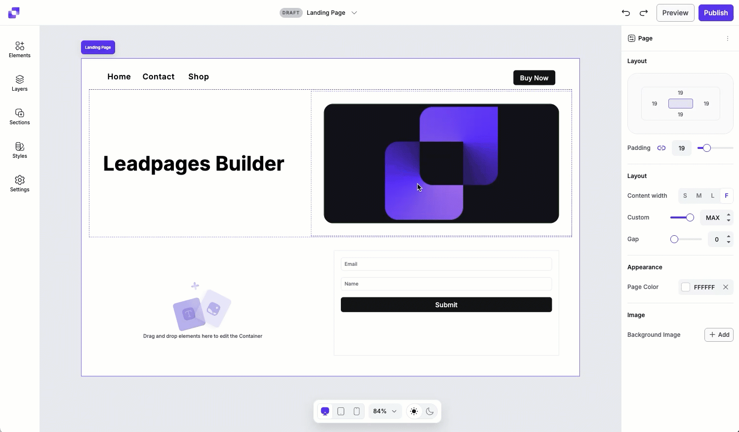
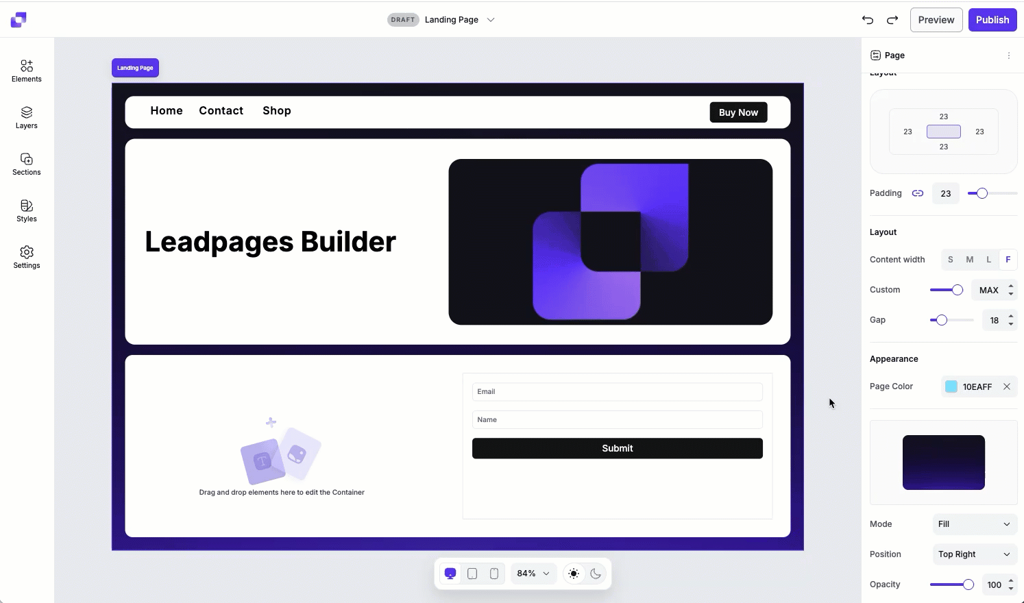
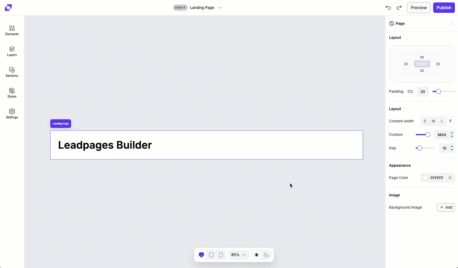
Page styles control the overall layout and background of your landing page. These settings apply at the page level and help you define spacing and alignment.
With Page styles, you can adjust the layout settings like padding, content width (small medium, large, full, or custom width), and the gap between parent containers (sections) on the page. You can also customize the page background by choosing a color or adding an image, with options to fine-tune the image's position, opacity, and display mode.
To access the Page stye settings, simply:
- Click anywhere outside of the canvas.
- Navigate to the Edit panel on the right-hand side of the editor.
Content width
Content width controls how wide your page content appears within the browser window—it determines the maximum width of your page's layout. You can choose from preset width options (S, M, L, F), or set a custom width to better fit your design needs. Smaller widths are ideal for focused content, and larger and full-width layouts work well for more immersive designs or visually rich pages.
Each preset option sets a specific pixel width that your content will fill at a maximum—your content on smaller devices won’t take up these full widths.
- Small: 768px
- Medium: 960px
- Large: 1200px
- Full: 2560px
Page background
The background is the visual foundation of the page. You can choose between a color background or an image background (or both!), depending on the look you want to achieve.
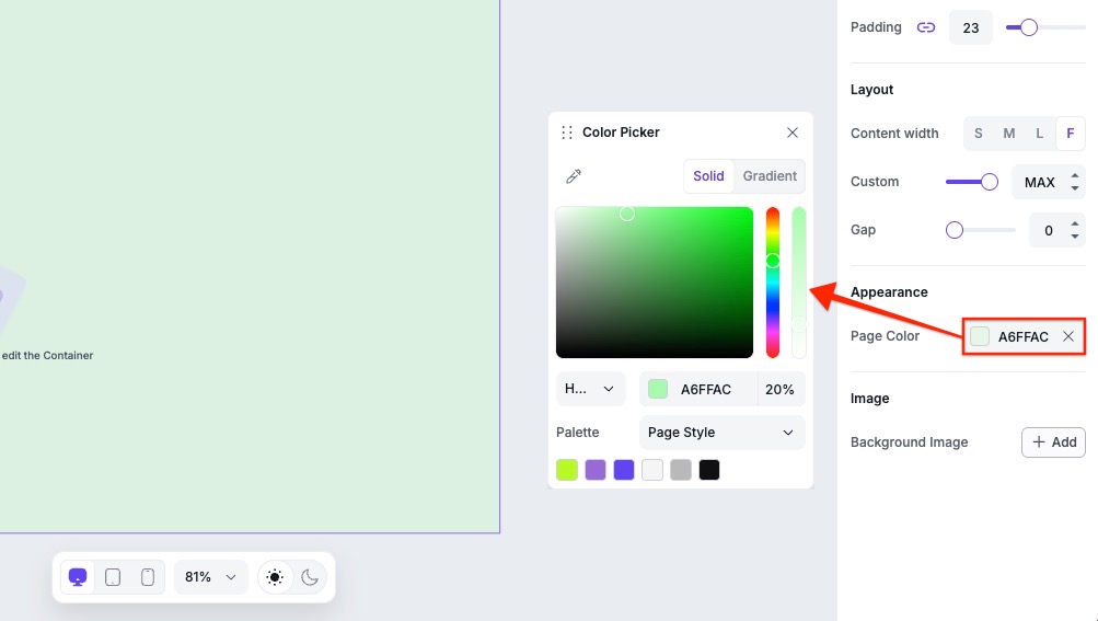
Color background
To set a color background, click the color HEX value field beside Page Color to open the color picker. From there, you can choose a color from your Style Kit (if one is applied), select a solid color, or create a gradient background.
Color options
A few things to note:
- Choose between HEX, RGB, or HSL color formats.
- HEX is selected by default.
- You can enter a specific color value manually, if needed.
- You can also adjust the opacity of the color you choose!
Gradient backgrounds
When using a gradient, you can choose between linear and radial styles. You can use the color bar to manage gradient colors.
- Click anywhere on the color bar to add a new colour to your gradient.
- To remove a color, simply click the color point you want to remove and press Delete.
- To change an existing color, click the color point and then adjust the color.
- Click and drag the color points to adjust its position in the color bar.
- To remove the gradient from the background entirely, click the X icon in the Page Color field.
Gradient Type settings
- Linear or radial: this sets the gradient style.
- Degree: adjust the direction of a linear gradient (for example, 0°, 90°, or 180°).
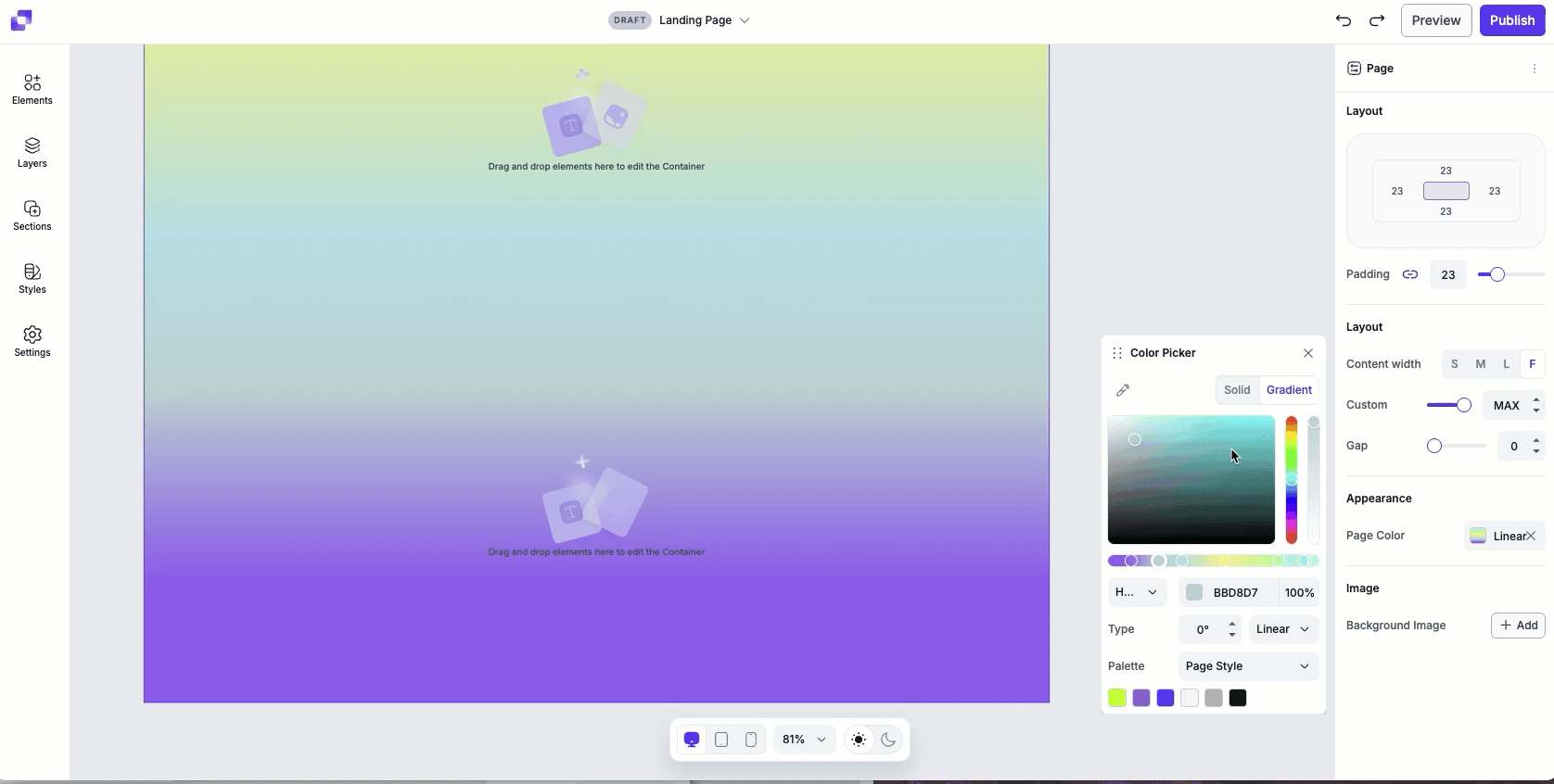
Image background
To use an image as your page background, click Add beside Background Image and upload an image from your computer. Once added, you can fine-tune how the image appears on the page.
Image settings
- Mode: Determines how the image fills the space on the page. Each mode can affect the image's size, scaling, and tiling. You'll have mode options like fit, fill, stretch, or tile.
- Position: Let's you control where your image is anchored within the page. You can choose a starting point such as top left, centre, right, bottom left, etc.
- Opacity: Adjust the transparency of the background image.
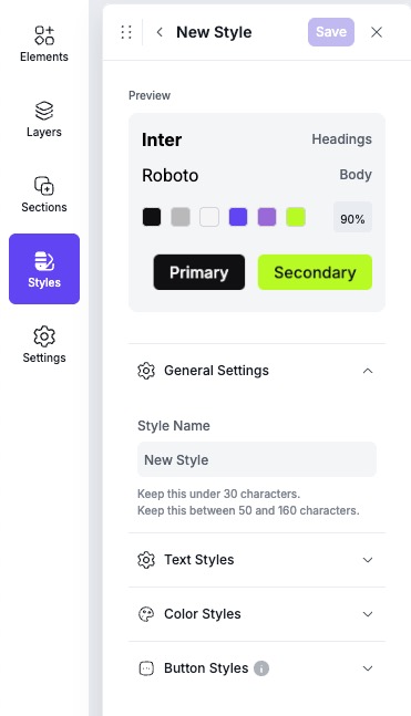
What is a style kit?
A style kit is a collection of global design settings that automatically apply to any element connected to it. The style kit includes:
- Text styles (heading, body, and link styles)
- Color styles (branded colors that will be easily accessible when applying colors to any elements on canvas)
- Button styles (primary, secondary, and tertiary)
If you have your text and button elements linked up to a style, any edits that you make to the style kit will update those elements on canvas.
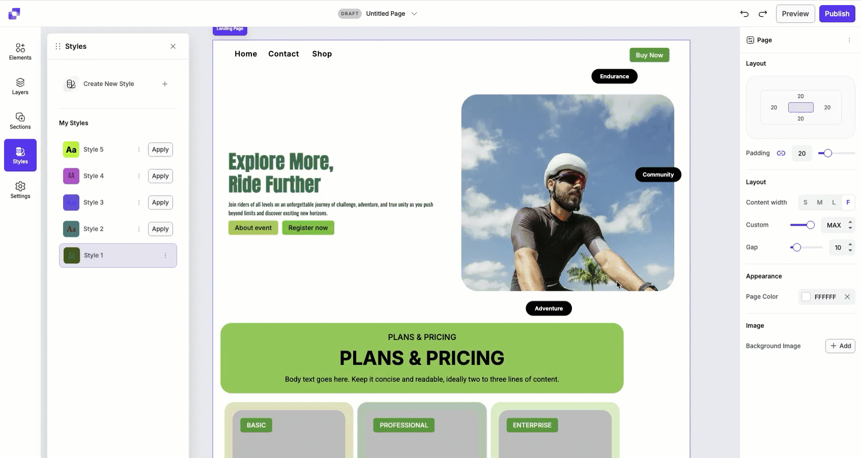
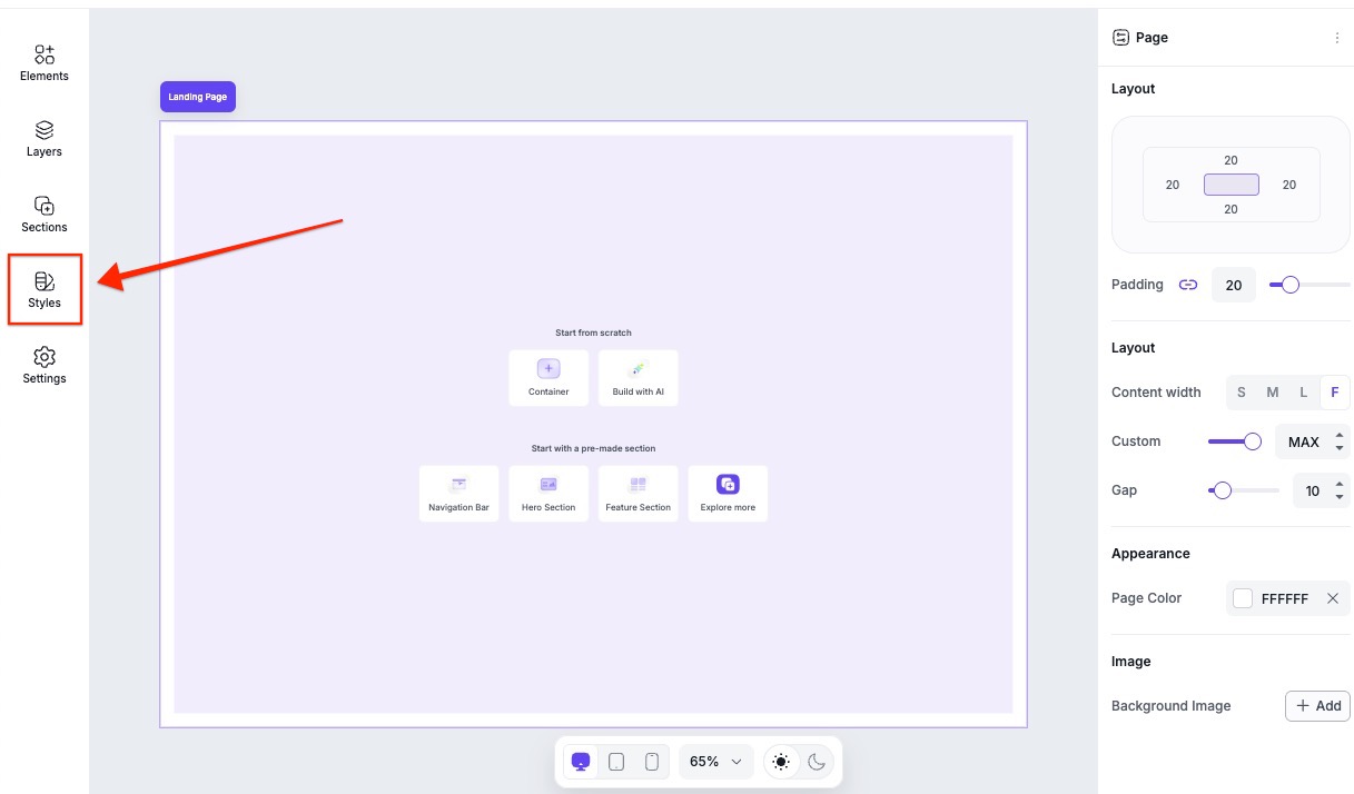
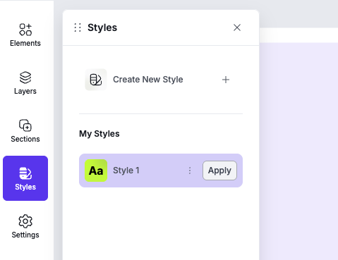
Where to find Styles
You can access them in the Page Studio builder’s left-hand sidebar, as shown below.
Premade styles
Premade style kits are available in the Styles Library, located in the Styles panel. Before you use a premade style kit, you'll need to add it to My Styles.
- Head to the Styles panel.
- Under Styles Library, click one of the available premade style kits.
- Click Add to add the style kit under My Styles.
- Once added, you'll be brought back to the main Styles panel. To apply the style kit, click Apply.
Creating a style kit
- Open Page Studio, and navigate to Styles.
- Click Create New Style.
- Under General Settings, add a Style Name.
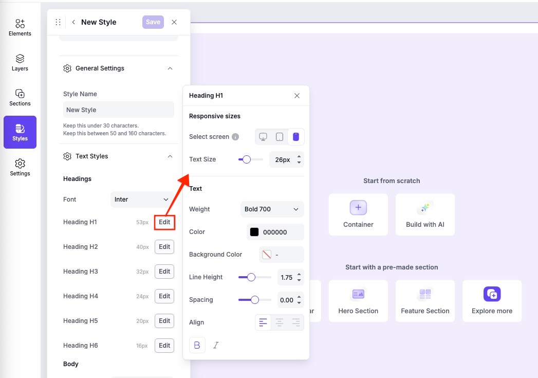
- Expand the Text Styles menu, then click Edit beside any heading, body, or link text you want to adjust.
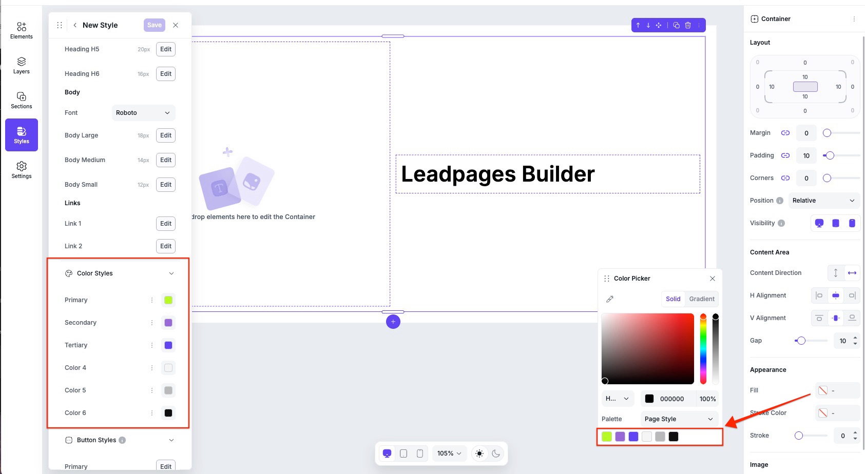
- Under Color Styles, click the color icons to set the colors.
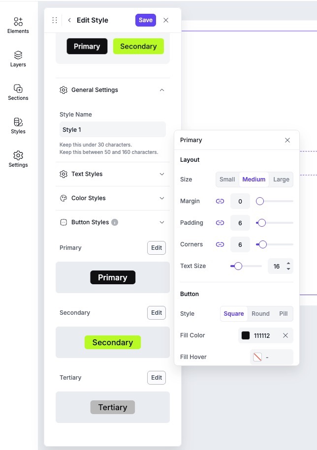
- Under Button Styles, click Edit beside the primary, secondary, and tertiary buttons to adjust the style.
- Save the style kit to see it appear under My Styles.
To learn more about customizing text styles, color styles, or button styles, continue reading below.
Text styles
With Text Styles, you have the option to set up the global styles for headings (H1-H6), paragraph body text, and linked text. There can only be one font selected for heading text and body text. Links will take on the font of the text type it was set up with (heading hyperlink or body paragraph hyperlink).
- For Heading text, you have the option to adjust the size of each heading type on desktop, tablet, and mobile.
- For Body text, you have three options: Large, Medium, and Small.
Color styles
Each style kit will be able to set up 6 brand colors. You have the option to rename the color style by clicking the “...” icon. Once the style kit it saved, and applied to your page, you will be able to see these brand colors appear in any color picker palette opened up on page for your element or page settings.
Button styles
You have the option to edit up to three button styles, primary, secondary, and tertiary. A preview of those styles will be shown under Button Styles, and you can edit each individual style by clicking Edit.
My Styles settings
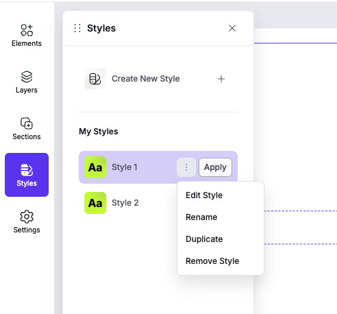
Should you need to edit, rename, duplicate, or remove an existing saved style, all you need to do is navigate to Styles, then under My Styles, click the actions icon [:] beside the style you want to adjust, then select an action.
Applying styles
Once you have a style kit created, you can apply that style to your page. Under My Styles, click the Apply button beside the style you want on the page.
Once applied, it will automatically update any elements that are currently attached to Styles. Should you need to attach or detach specific elements to your style, this can be done in the element’s settings, in the Edit panel.
Attaching and Detaching an element from Styles
By default, elements that you add to the canvas (such as text or button elements) are connected to Styles. This means they'll follow your page's style settings, even if yo haven't applied a style kit yet.
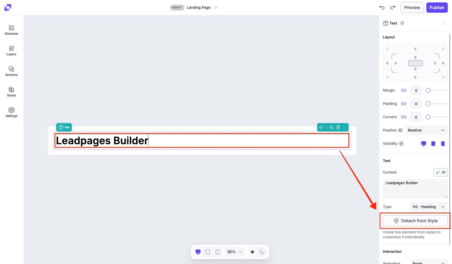
Detach from Styles
If you want to customize an element independently from your Styles, you can detach it:
- Click the element on the canvas.
- In the right-side Edit panel, click Detach from Style.
Once detached, the element can be styled individually without affecting or being affected by Styles.
Attach to Styles
If you'd like to reconnect an element to Styles:
- Click the element on the canvas.
- In the Edit panel, click Apply Style.
- After it's reattached, you can choose the text type (H1, H2, H3, etc.) to control how it inherits your style settings.
Frequently Asked Questions
Can I upload a custom font to my style kit?
No. At this time you will not be able to use a custom font to your Page Builder pages. Any custom fonts uploaded (under Brand on your Dashboard) will only be accessible in Classic Builder pages.
Can I have more than one style kit applied to my page?
No, you will only be able to apply one style kit to your page. Should you want to adjust the styles of individual elements, you will have to detach them from Styles.
Can I add a video background to my page?
Currently, we only offer the ability to add a color, image or GIF to the background of your page.
Can I add custom CSS to my page?
Page Studio does not offer the ability to add custom CSS to your page at this time. However, you are welcome to add any custom code into the HTML widget. Just note, that we can't guarantee that all custom code added will function within the editor, nor would we be able to troubleshoot any issues that arise from it.
Need more help?
You can always get in touch with our support team—just click Support in your Leadpages navigation menu, or submit a ticket ↗